A new feature for Apple Music
For the second capstone project during DesignLab's UX Design boot camp, student were required to add a brand new feature to an existing app while respecting the app's branding.
The Project
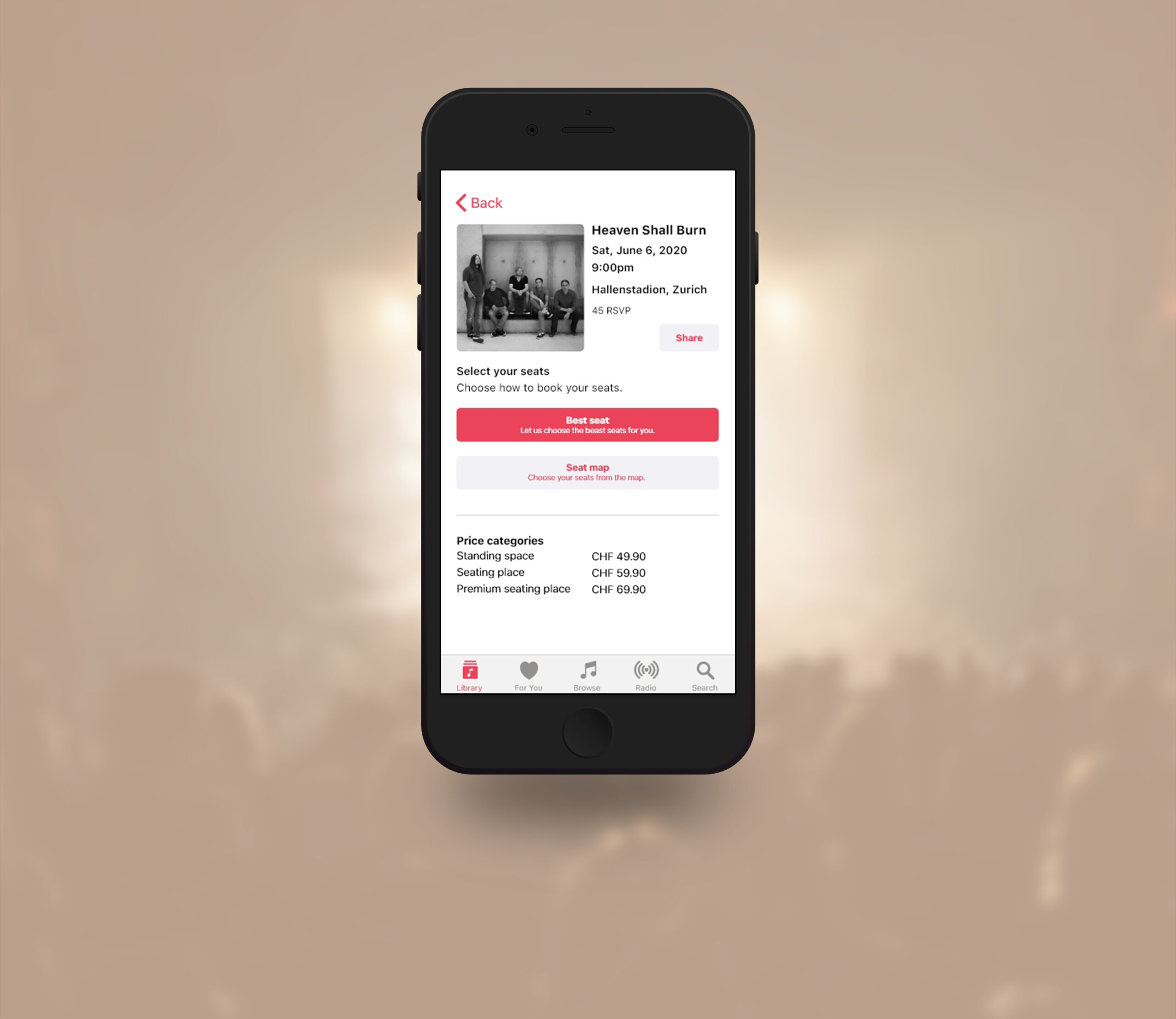
For the second capstone project of UX Academy's curriculum, students were required to add a new feature to an existing app. Being a music enthusiast and after looking for inspiration on Google, I decided to design a function that would allow users to buy concert tickets directly via Apple Music. I also added a minor feature that would allow users get notified whenever their favorite band would perform near the fan's location.
The main goal of this project was to work with given UI guidelines. I therefore had to follow the exiting layout of the Apple Music app, as well as to integrate any other iOs UI element that I would need to complete the flow of buying a ticket.
Duration: 1 month.
Role: UX Researcher, UX/UI Designer.
Tools: Figma, Adobe XD, InVision, Illustrator, Maze.
The Process
I carried out this project by applying the Design Thinking method.
STEP 1
EMPATHIZE
Research
Persona
STEP 2
DEFINE
Task flows
User flows
STEP 3
IDEATE
Wireframes
Mockup
STEP 4
PROTOTYPE
STEP 5
TEST
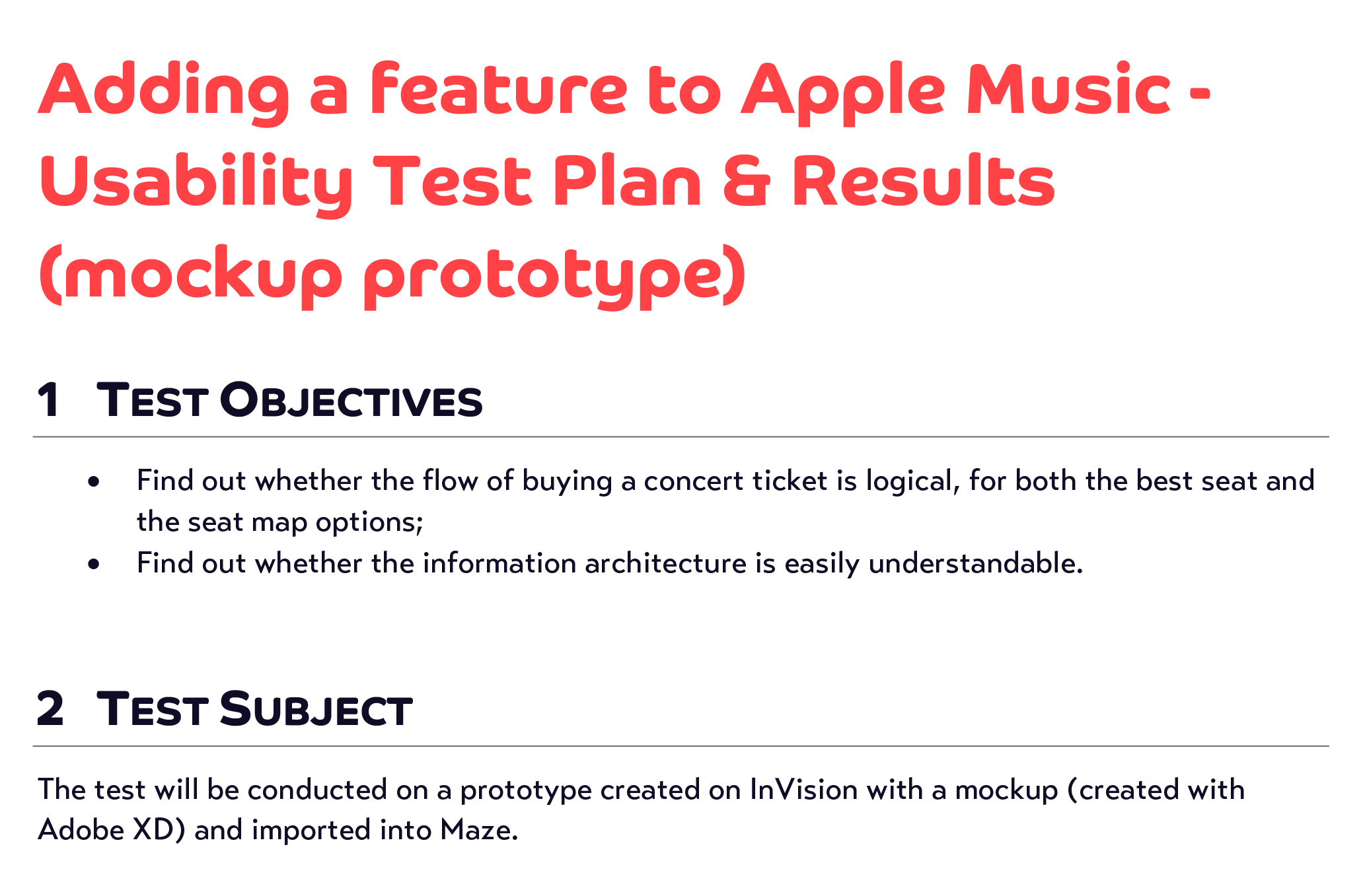
Usability test plan
Usability tests
Report
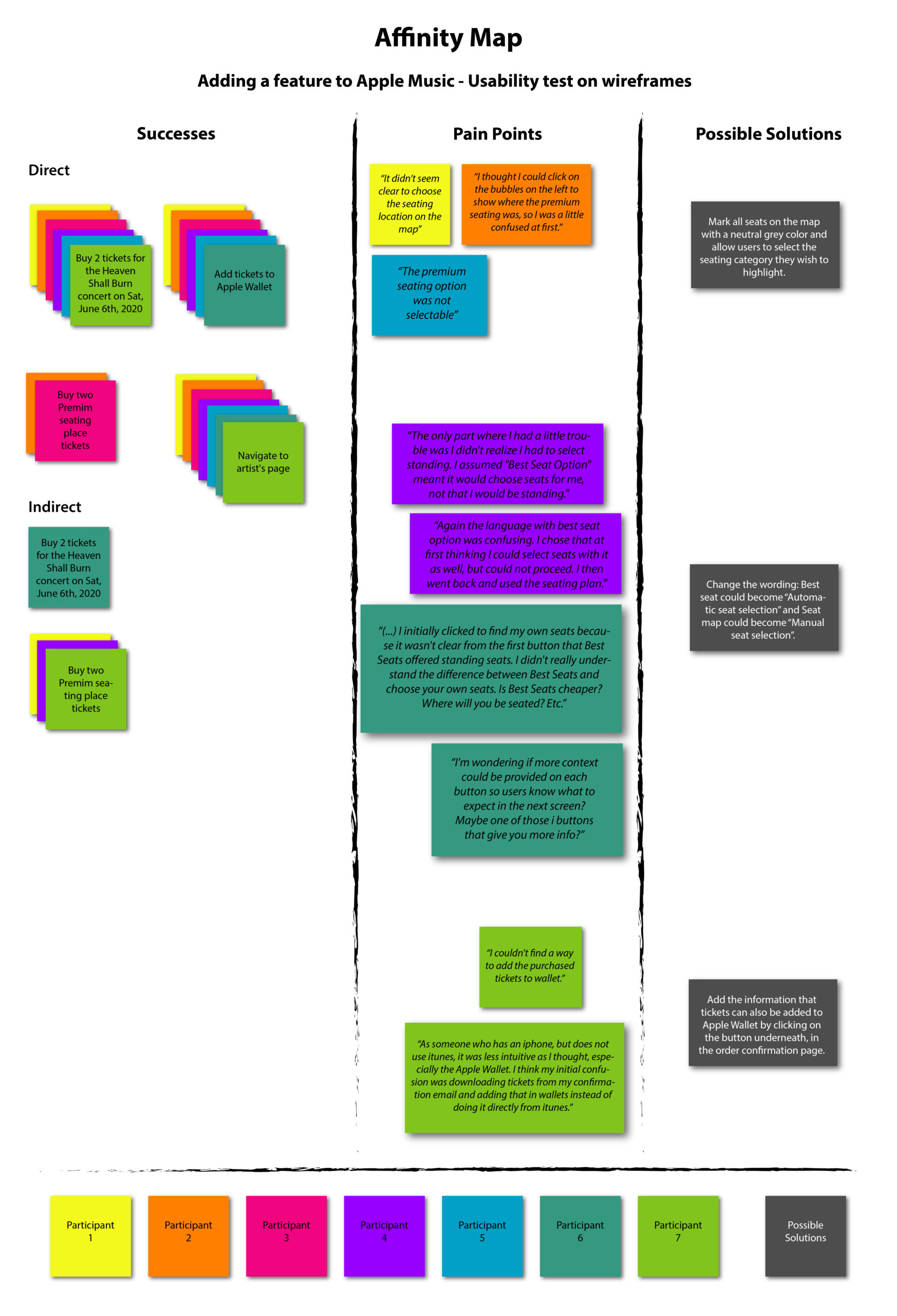
Affinity map
ITERATE
STEP 1 - EMPATHIZE
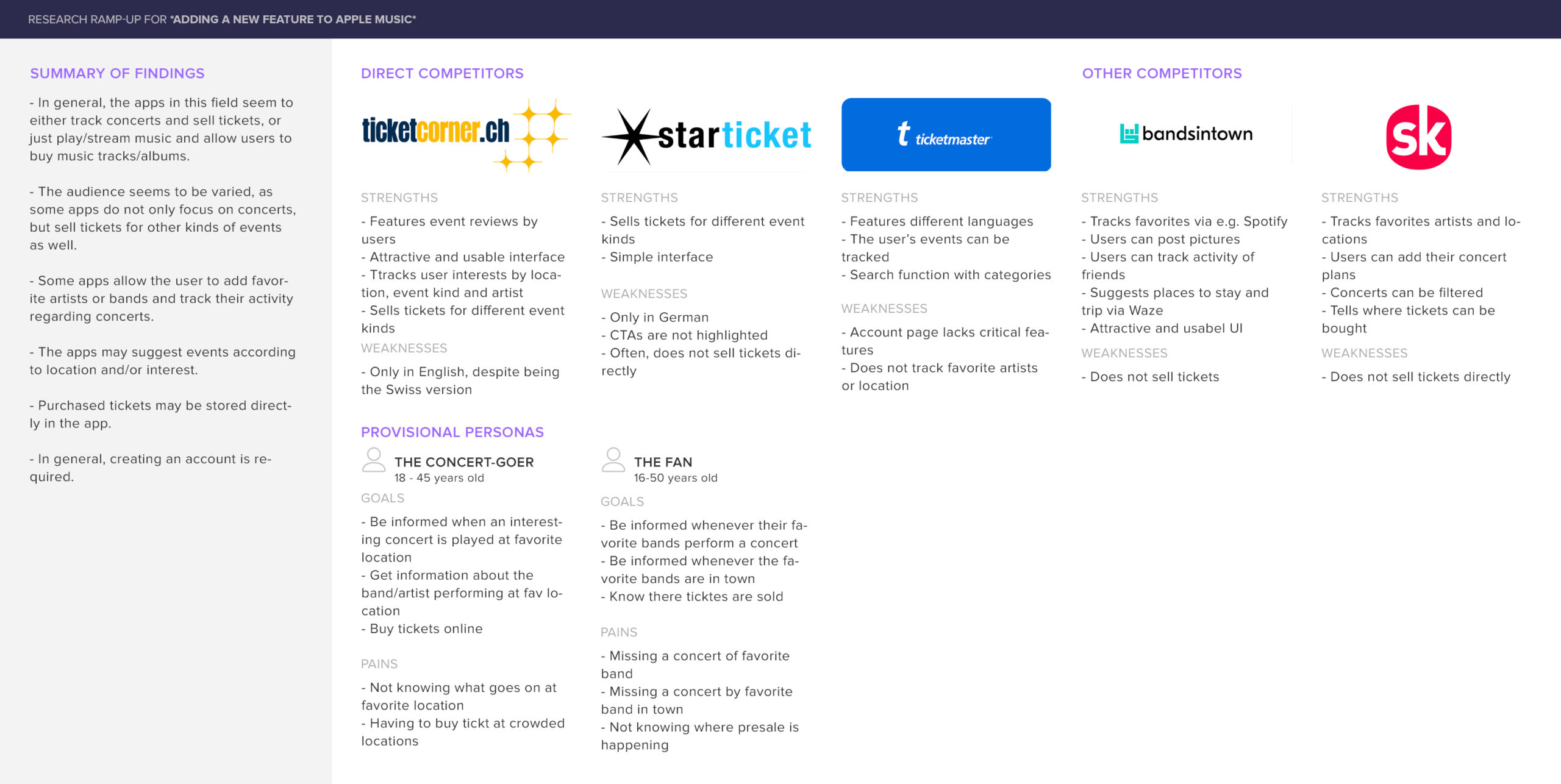
The competitor analysis I carried out at the very beginning of the "empathize stage" during the research ramp-up showed that in general, users were able to track their favorite bands and synchronize the app with their favorite music app, being it Apple Music or Spotify. The events were not limited to concerts, but also included other kinds of events.
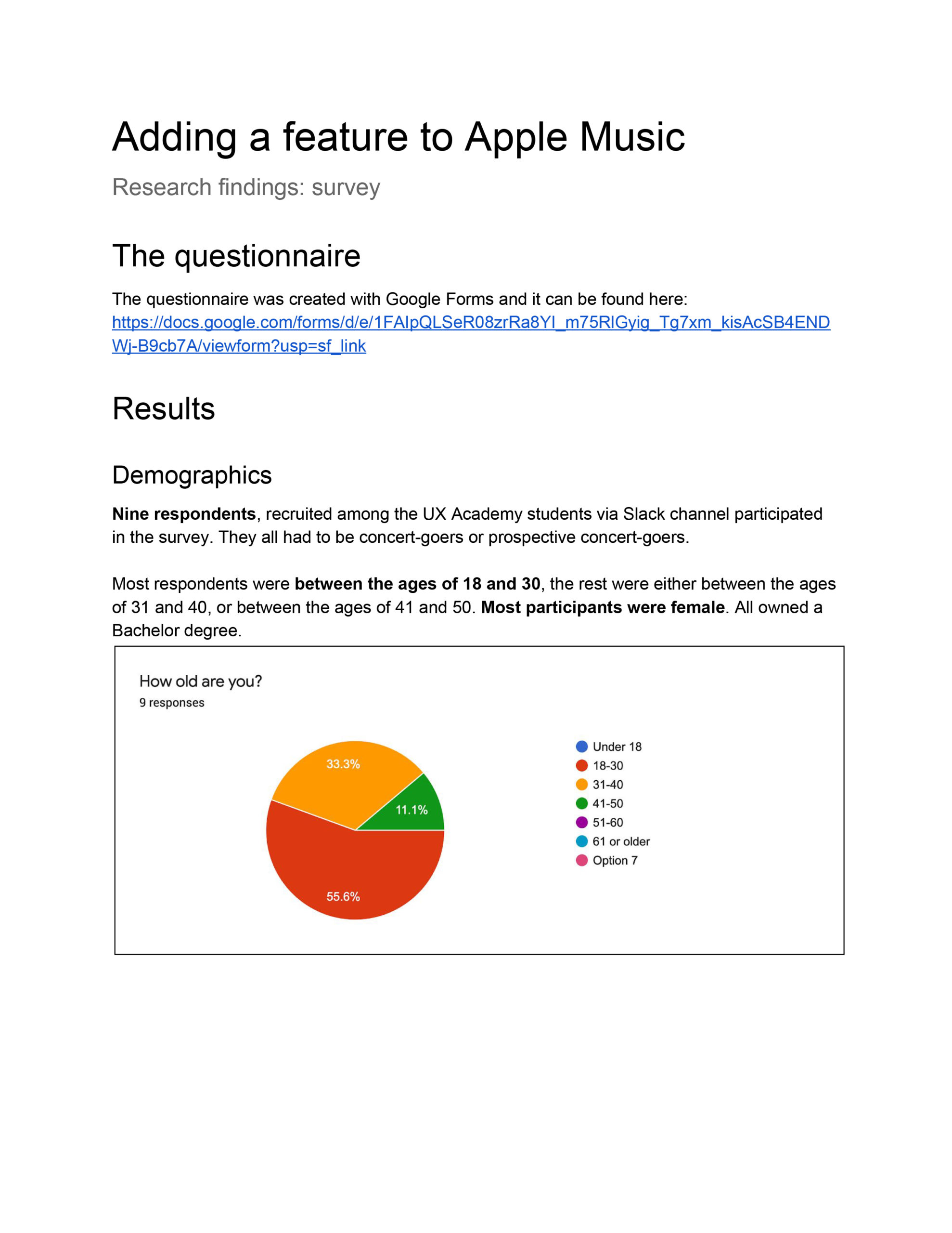
To find out more about concert-goers (i.e. their habits and who they were demographically), I created an online questionnaire with Google Forms, which allowed me to investigate how these people stayed informed about the concerts of their favorite bands/artists. Moreover, I managed to investigate how popular the concept of buying concert tickets via an app would be, what the users would expect from such an app and what their experiences were, if they had already used such apps.
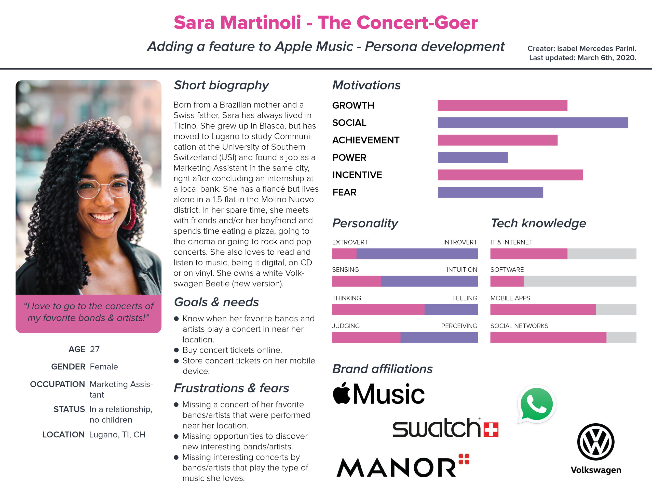
It was interesting to find out that only a few respondents used Apple Music, with Spotify being their favorite app. They only bought concert tickets online, usually via a website, far less via an app. Thanks to these findings, which I gathered in a report, I developed a persona that would represent the users.
STEP 2 - DEFINE
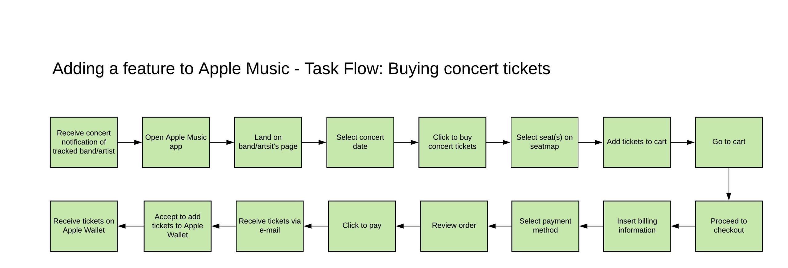
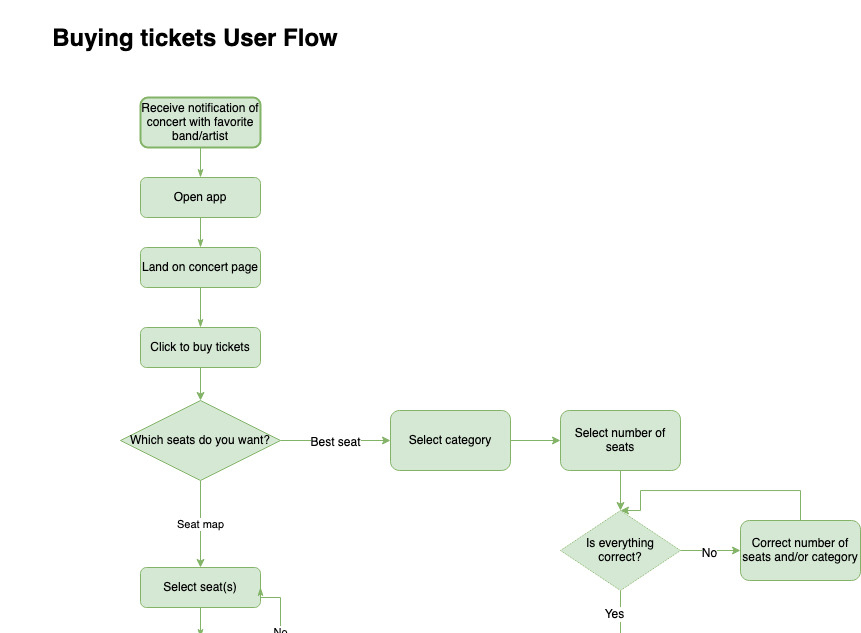
These two schematics would outline the steps required to purchase a ticket via Apple Music with my new, hypothetical added feature.
STEP 3 - IDEATE
After deciding how the flow of purchasing a ticket would be, I started to create the wireframes with Figma. The Information Architecture had to match that of the Apple Music app.
In order to test if the ticket purchase flow was logical, I conducted the first usability tests using Maze. As the results were promising, I applied the feedback I received while focusing on the next substep, i.e. creating the mockup.
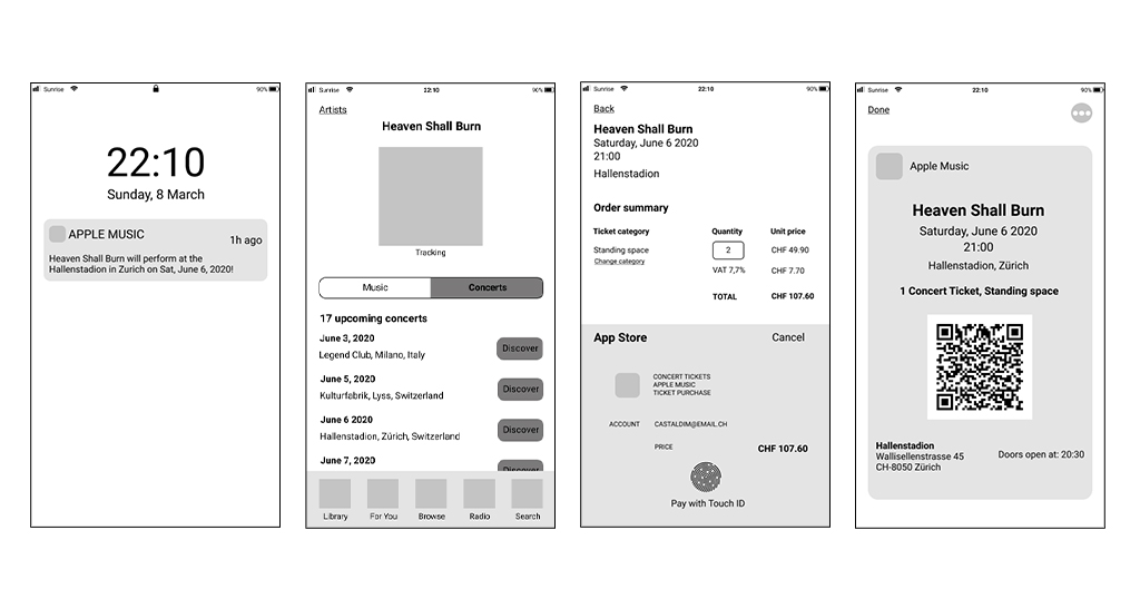
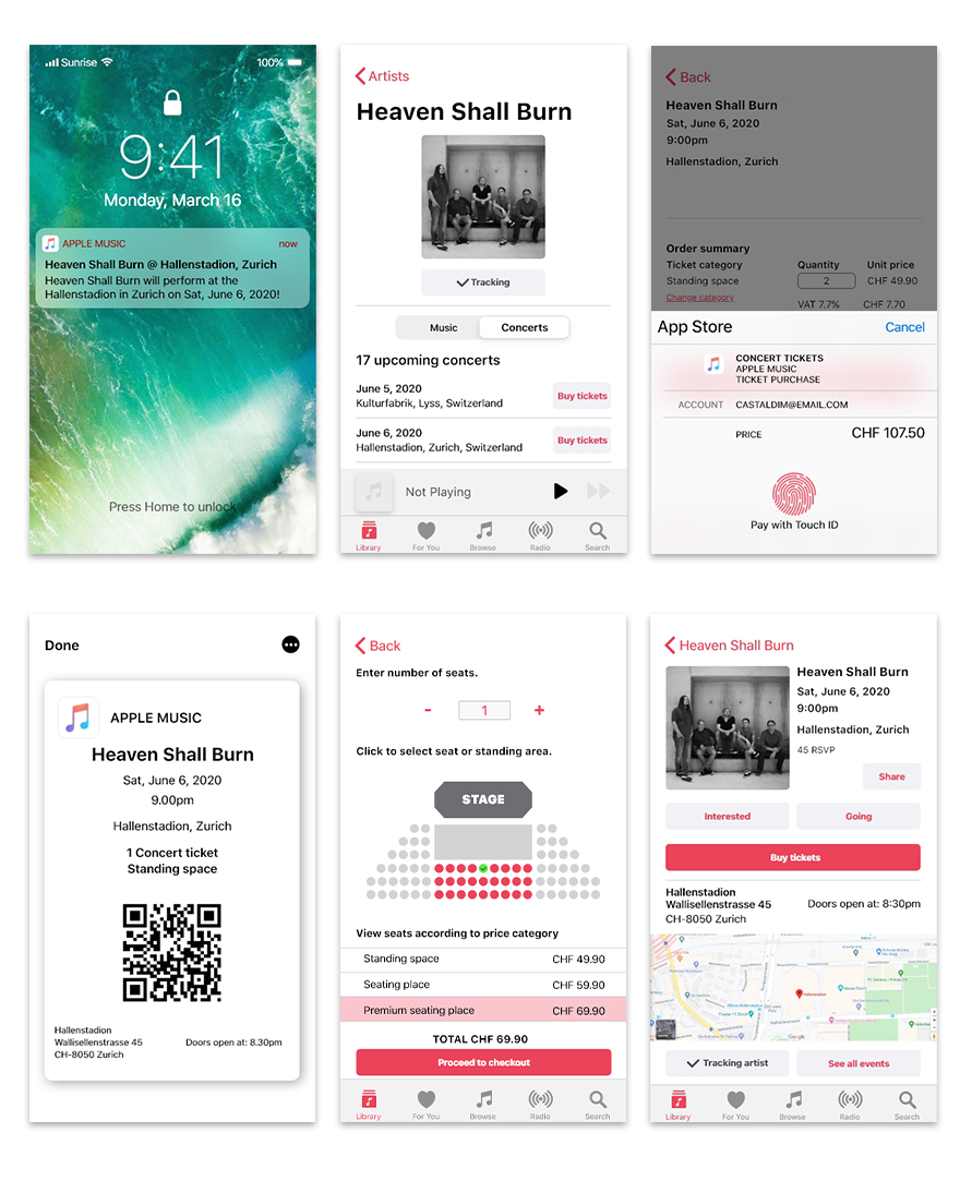
As iOs UI elements were not available for Figma, I chose to use Adobe XD to create the high-fidelity screens.
Following Apple Music's UI guidelines, I integrated already existing elements and designed new ones whenever I needed them, always trying to make the UI feel like that of the original Apple Music app.
STEP 4 - PROTOTYPE
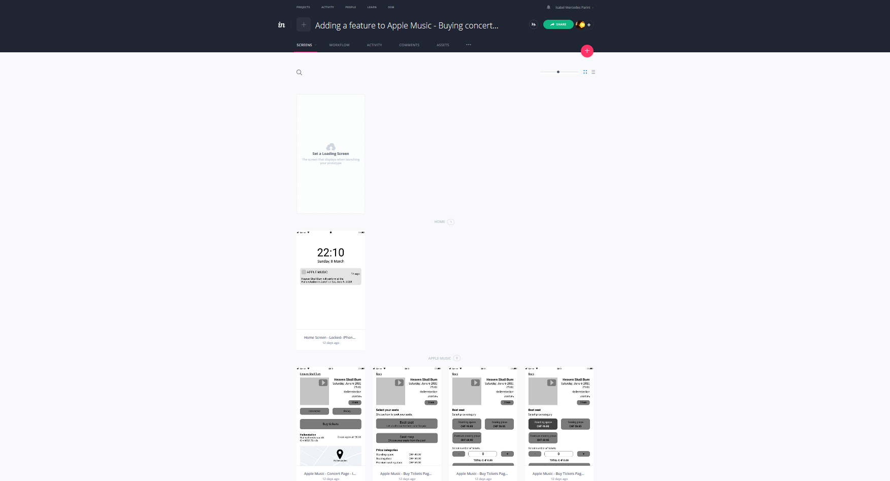
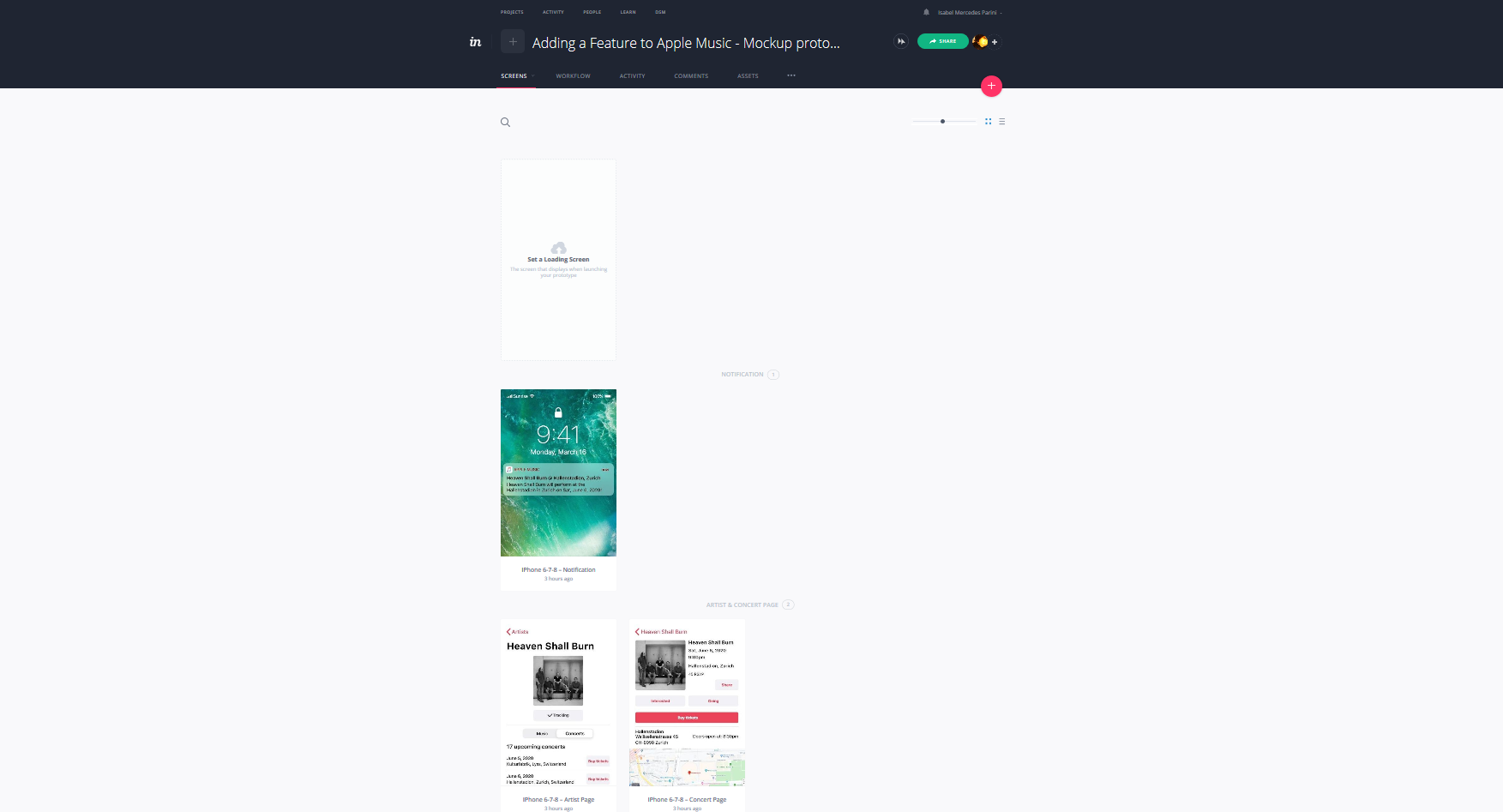
I created two protoypes with InVision: one with the wireframes, as already anticipated in the previous section, and one with the mockup screens.
Both of the prototypes helped me out figuring out which other screens I had to design to complete the flow for the next step, i.e. the true test phase.
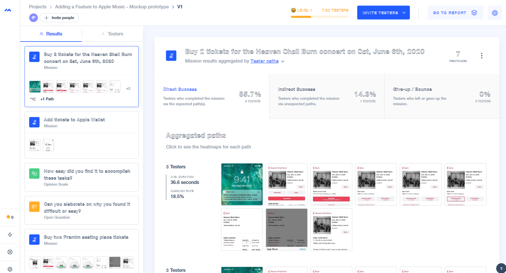
STEP 5 - TEST
For both tests, I used Maze.
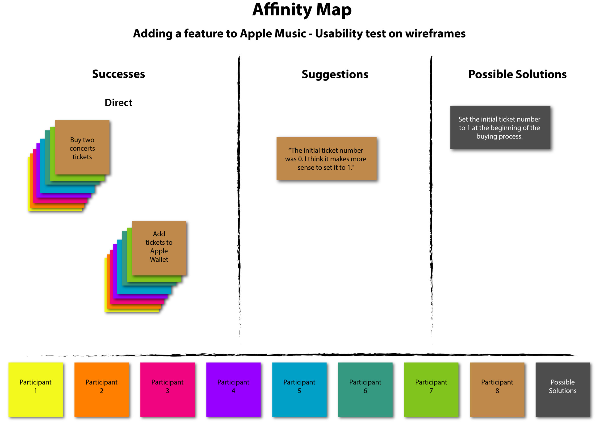
The wireframes test ran smoothly, with users being able to complete all tasks within a reasonable amount of time. A suggestion to change the default ticket amount to 1 instead of zero was applied to the mockups.
Testing the mockups allowed me to gather valuable insights that led to changes in the wording of some buttons, as well as to improvements of the seat map feature that puzzled some of the participants.
Both test sessions led to the creation of a report and an Affinity Map (one for the wireframes and one for the mockup version).
Conclusion
Being the second independent project, applying the steps of the Design Thinking process was almost effortless. Moreover, being a project in which a feature had to be added to an existing app, it was clear which substeps had to be carried out.
Adding a feature to an existing app seemed challenging at first, as I would have to follow already existing guidelines and patterns. However, this made the whole process of actually creating the layout easier.
In order to ensure an optimal experience, I decided to run two usability tests during the ideate phase, forseeing that the biggest changes might be required before starting with the mockup. Instead, the test on the mockup highlighted the biggest issues, which helped me polishing out the screens.
Despite the challenge of working within an existing framework, adding a feature to an existing app was interesting and useful, as it allowed me to get to know another real-life scenario.
Selected Works
Contact Me
Copyright © 2025 Isabel Mercedes Parini.
All rights reserved.