KAUS
The first project during my DesignLab UX Design boot camp journey required the responsive design and branding of an imaginarycompany. I chose insurance firm KAUS.
The Project
The first project of DesignLab's UX Academy was the design of a new, responsive e-commerce website and logo for KAUS, a fictional insurance company that sells prepared packages that can be customized to a certain extent for any situation, both for businesses and for individuals.
The focus was set on creating a website for private customers with easily navigable insurance categories.
Duration: 10 weeks.
Role: UX Researcher, UX/UI Designer.
Tools: Illustrator, Figma, InVision.
The Process
I relied on the Design Thinking process while working on this project.
STEP 1
EMPATHIZE
Research
Persona
Empathy Map
Storyboard
STEP 2
DEFINE
Project Goals
Feature roadmap
Card Sorting
Sitemap
Task flows
User flows
STEP 3
IDEATE
Wireframes
Moodboard
Logo
Style Tile
Mockups
UI Kit
STEP 4
PROTOTYPE
STEP 5
TEST
Usability Test Plan
Usability Tests
Report
Affinity Map
ITERATE
STEP 1 - EMPATHIZE
In order to empathize with the potential users and fully understand the problem, I conducted research by means of a competitor analysis and customer interviews (in-person, except for one, which happend over the phone). This allowed me to get to know the company's business type, see how competitors solved the problem and investigate how and why customers chose an insurance company over another one, what insurances they owned and whether they had already visited the website of a insurance company and purchase an insurance policy online.
It was interesting to find out that none of the participants had purchased an insurance online and that they usually chose their insurance company according to the referral of people they know (friends or family members).
The results, which I gathered in the research ramp-up, led to the creation of a persona that would represent the customers, as well as an empathy map and a storyboard illustrating how and why the persona decided to change the company for their car insurance policy.
STEP 2 - DEFINE
Based on the research findings gathered during the Empathize phase, I defined a possible solution to the problem at hand.
First, I identified the business and user goals, as well as the technical considerations, which led to the development of a feature roadmap that presented the features categorized according to their importance and urgency.
A card sorting session was also organized, in order to find names for the insurance categories that would be meaningful and logical to users.
With all this information I was ready to create a sitemap that would illustrate the hierarchy and sections of the website, as well as a task flow and some user flows that would show the steps a user would go through to buy an insurance. This helped me define the UI requirements.
STEP 3 - IDEATE
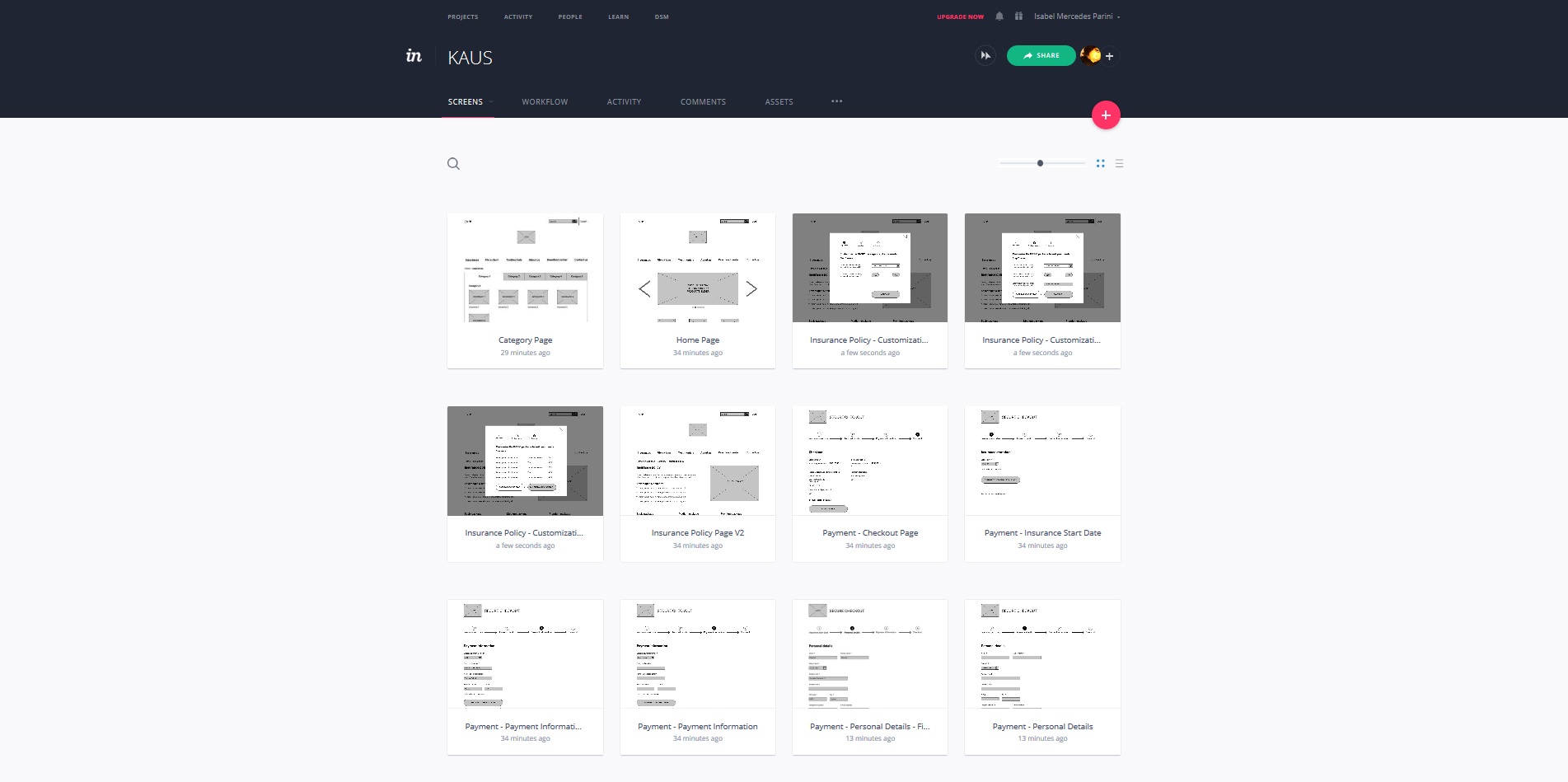
After emphasizing with the users, analyzing the problem and defining the solution, it was time to create grid-based, responsive wireframes for desktop, tablet and mobile screens using Figma. This was also the time to create KAUS' new logo.
Before starting with sketches, I did a brainstorming session to find the attributes that would define the company's look and feel and then created a moodboard. The final result was a brand new logo and style guide that would define the visual elements of the website.
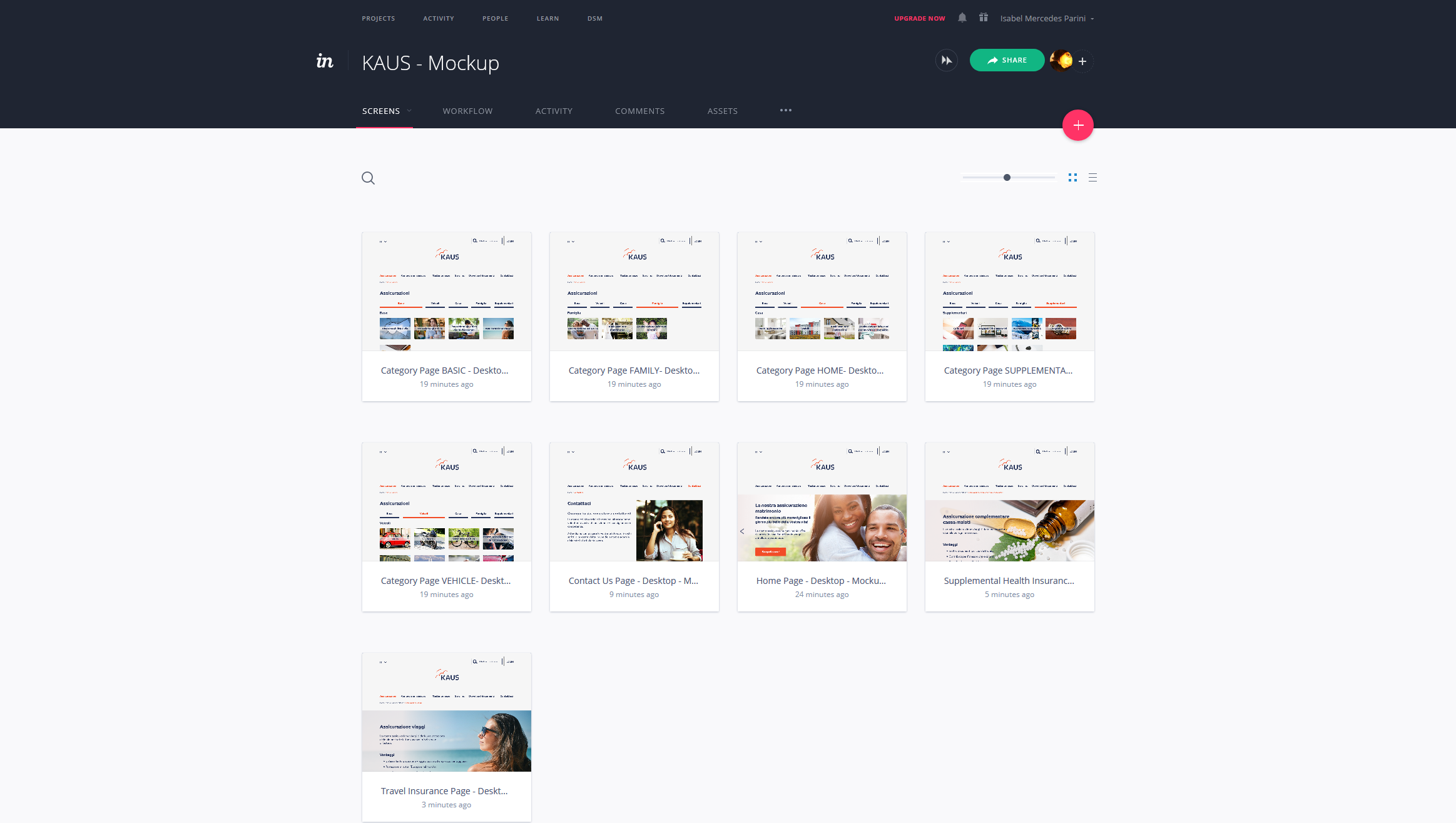
Based on the wireframes and the style tile, I created a responsive mockup of the homepage and a comprehensive UI kit.
STEP 4 - PROTOTYPE
I created an early prototype with InVision, based on the wireframes. The purpose was to learn to use the environment only, as it was not used during any test. It also allowed me to figure out better all the steps the user had to go through while purchasing an insurance on the new website.
I developed another prototype with InVision using the mockup screens. This time, I used it to test the desktop version with real users during the next phase.
STEP 5 - TEST
Once the mockup prototype was ready, I created a usability test plan in order determine the characteristics of the participants, their tasks, the goals of the test, etc.
After the usability tests, which were conducted in-person, I gathered the results in a report and laid the findings out in an affinity map that also presented possible solutions to any issue that was identified.
Overall, the prototype performed well with the given tasks and the participants, highlighting only a few issues, e.g. some participants not identifying the main menu right away. A possibile solution to this would be to style the main menu differently, for example separating header from body content with a spacer.
Conclusion
Overall, the process ran smoothly. I only wish I would have been able to recruit more people for the card sorting sessions and for the usability tests. The results of each phase reverberated on the next one(s), proving the usefulness of the Design Thinking process, especially the efficacy of iteration, which was a constant companion.
Given more time, I would have conducted other card sorting sessions with more participants, in order to define even better insurance categories; conducted tests on the categories and on the buying process with more participants to identify potential hiccups. Nonetheless, the resulting website proved to be a valid solution, since it would allow users to easily navigate KAUS' different policies on mobile, tablet and desktop screens and purchase them online.
Selected Works
Contact Me
Copyright © 2025 Isabel Mercedes Parini.
All rights reserved.


