Doraky
App
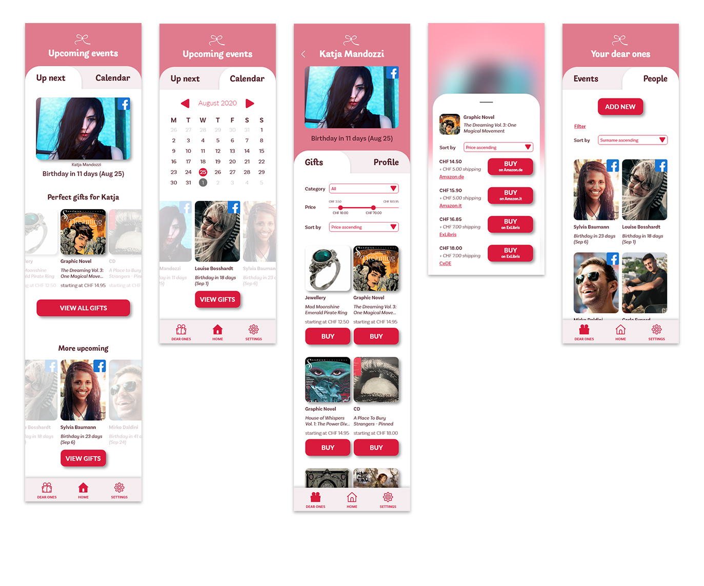
This app I designed would be the perfect companion you need to find a gift for your loved ones.
The Project
Finding the right gift for our friends and family is sometimes a difficult endeavor: we are either afraid the idea we had would not suit the one receiving our gift, or we do not have an idea at all. Enter “Doraky”, which comes from the Greek word for gift, i.e. δωράκι (do̱ráki).
Doraky would suggest the best gifts according to different custom parameters (e.g. age, gender, hobbies) or by connecting with Facebook and scanning the friend’s or family member’s profile.
The app would also remind the user when the saved friends and family
members have their birthdays or when e.g. it is soon going to be Christmas or Valentine’s Day.
Doraky would also suggest where the user can buy online the gifts it suggests.
This was a small project created during DesignLab's Career Services program.
Duration: 1 week.
Role: UX/UI Designer.
Tools: Adobe XD, InVision, Illustrator.
The Process
For this project, I followed the Design Thinking process. Being it a short project, however, I skipped the first step (i.e. "Empathize") and started with the "Define" phase right away. No testing was involved, as it is more of a concept.
STEP 1
DEFINE
Sitemap
Task flows
User flows
STEP 2
IDEATE
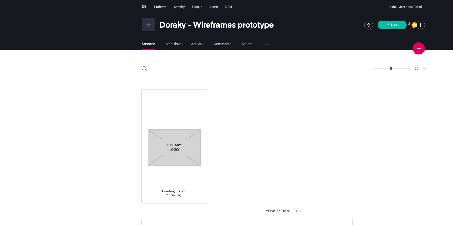
Wireframes
Logo
Style Tile
Mockup
STEP 3
PROTOTYPE
ITERATE
STEP 1 - DEFINE
After defining the scope, focus, goals and main features of the app and explaining them in a briefing, I created a sitemap to visualize the structure of the app and its navigation.
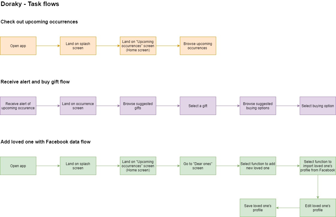
Once the structure was defined, I proceeded with creating the task flows to fully understand the steps a user would go through to reach three main goals (check out upcoming occurences, receive an alert and buy a gift and, finally, a flow for adding a beloved one with Facebook).
The task flows then lay the foundations for the three user flows, which allowed me to understand better each step and the different routes a user might take to achieve their goal.
STEP 2 - IDEATE
Before starting with the definition of the elements of the screens and their hierarchy, I focused on finding a suitable branding, starting with the logo.
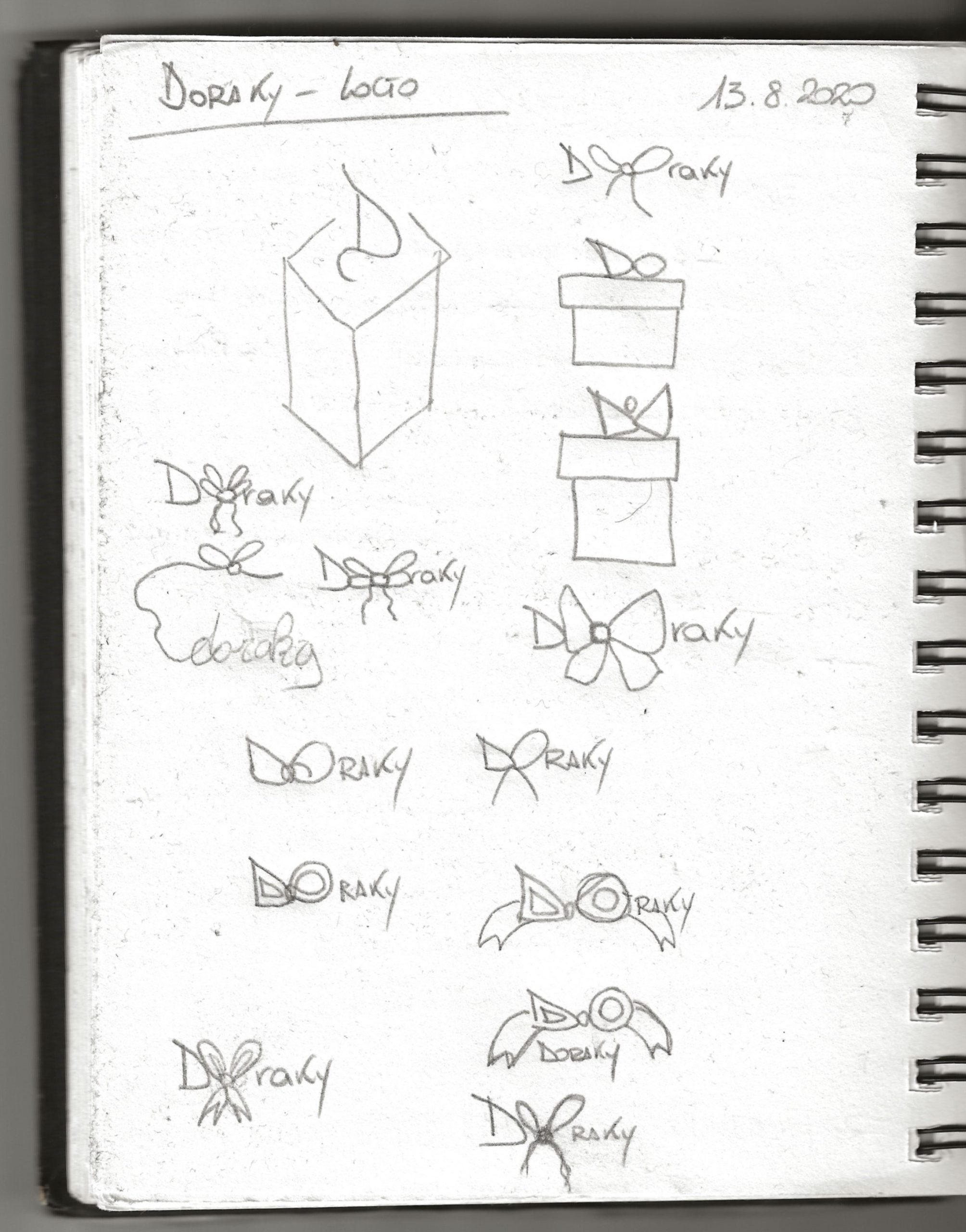
After some exploratory sketches, I proceeded to work in Illustrator, playing around with different typefaces, distorting and customizing them. I wanted to incorporate a drawing that would remind a gift and decided the a ribbon would be the most intuitive solution.
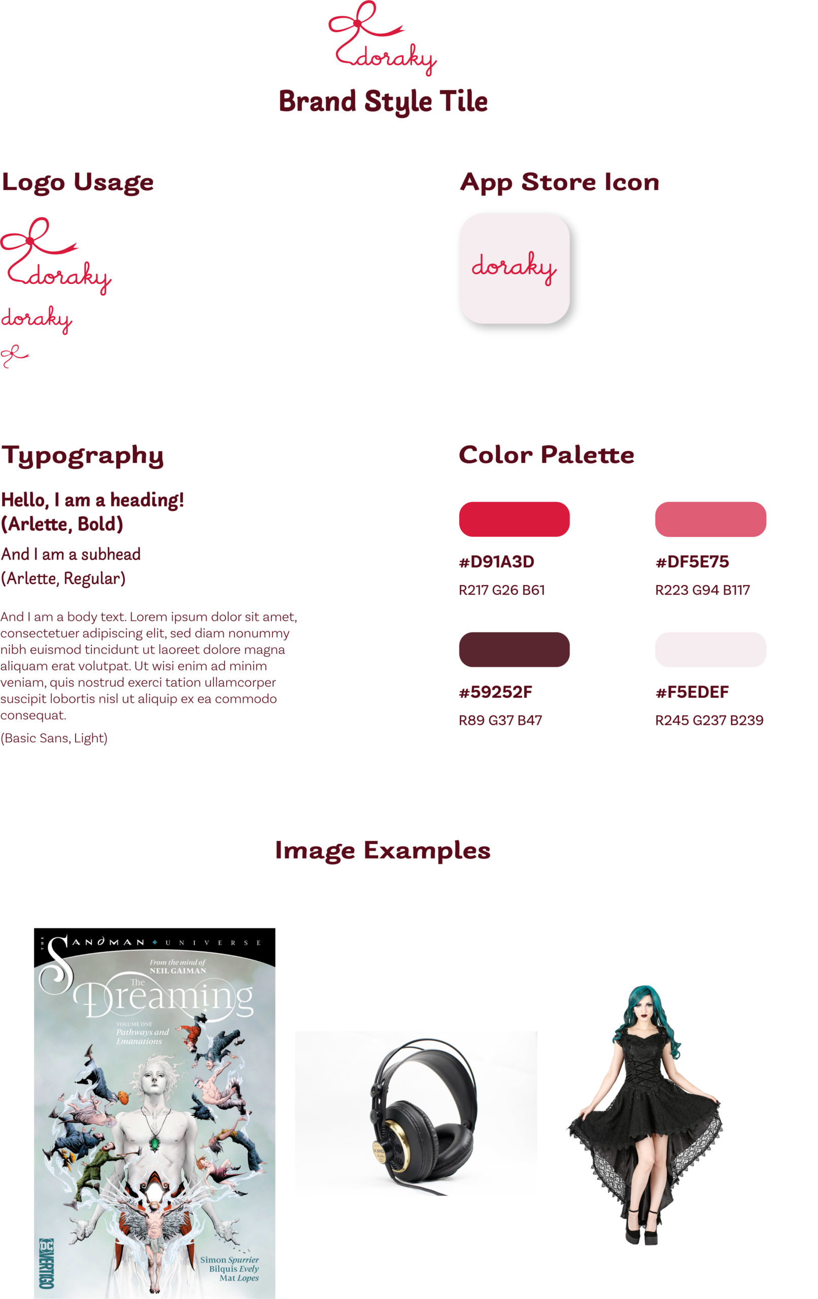
Once the logo was created, I tried to find the right color palette and applied it to the logo. The color palette was extracted with Adobe Color from the photograph of a gift I found on Pixabay, in order to suit the whole concept. I went for a red color palette, as this color can generate excitement and may remind of Valentine's Day (red as a color for love) or Christmas (red and green). Finally I selected two suitable typfaces and some sample images to illustrate the gifts to complete the style tile.
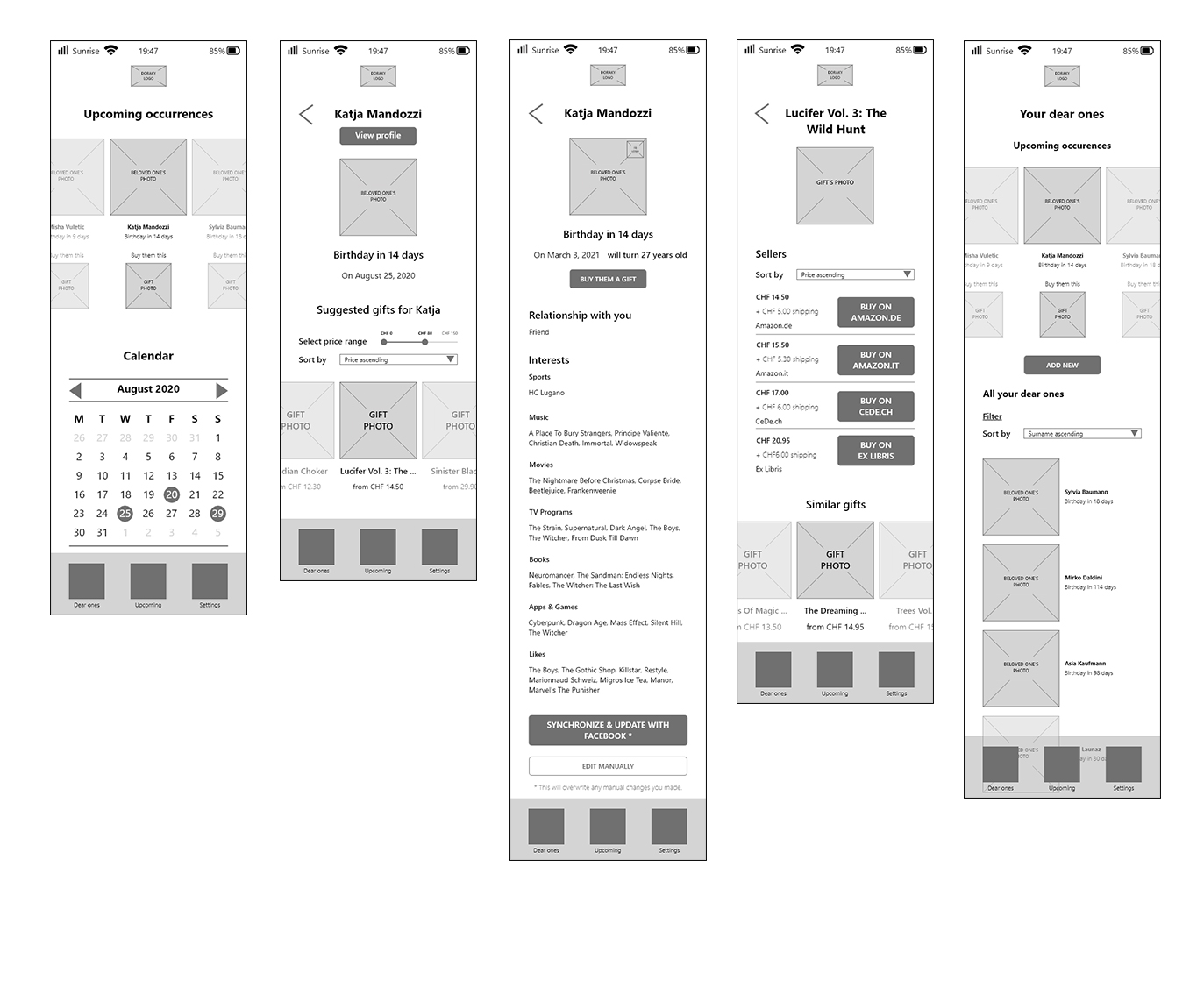
After determining the look and feel of the app, following the goals of the task and user flows, I started to create the grid-based wireframes with Adobe XD to define the way the content on each screen, the way it would be organized, and the hierarchy among the elements. Later, I applied the details described in the style tile and created a grid-based, high-fidelity mockup, once again using Adobe XD.
STEP 3 - PROTOTYPE
I had already created a prototype with Adobe XD during the wireframes phase to test myself so that I could find out whether screens were missing while trying to complete the flows.
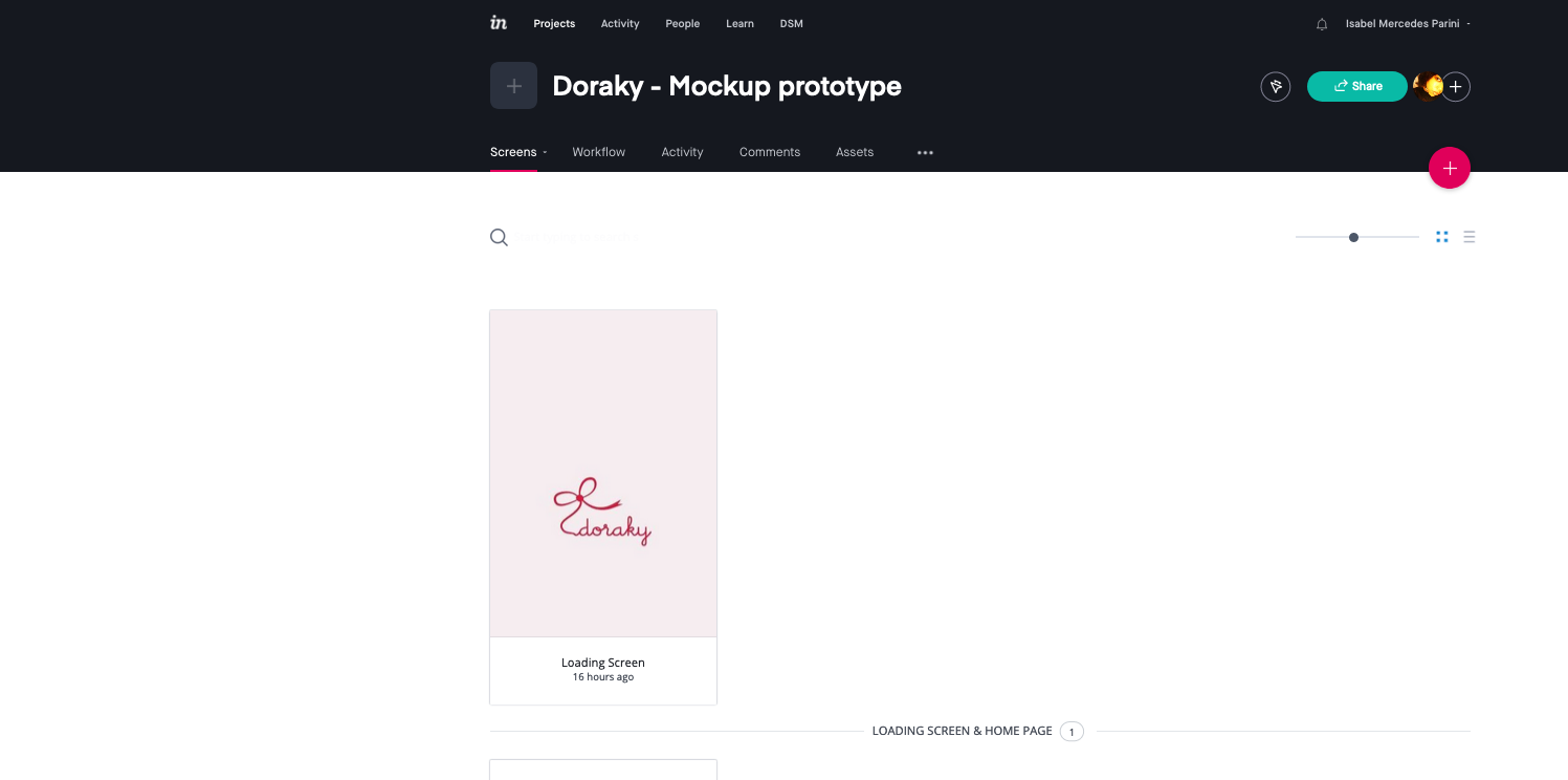
For the prototype of the mockup version, I used both Adobe XD and InVision.
Conclusion
For this mini-project I was asked to focus on some aspects of the design process, i.e. creating task and user flows, wireframes and a mockup. I also added some other deliverables and activities that would help me during the process, like e.g. the sitemap and the branding.
Of course, despite being out of scope, a thorough research, including a competitor analysis, and user testing would have allowed me to improve the app even further.
Selected Works
Contact Me
Copyright © 2025 Isabel Mercedes Parini.
All rights reserved.

