Il Paese dei Gatti
For the first Capstone Project of DesignLab's UX Design bootcamp I chose to redesign the website of a cat shelter.
The Project
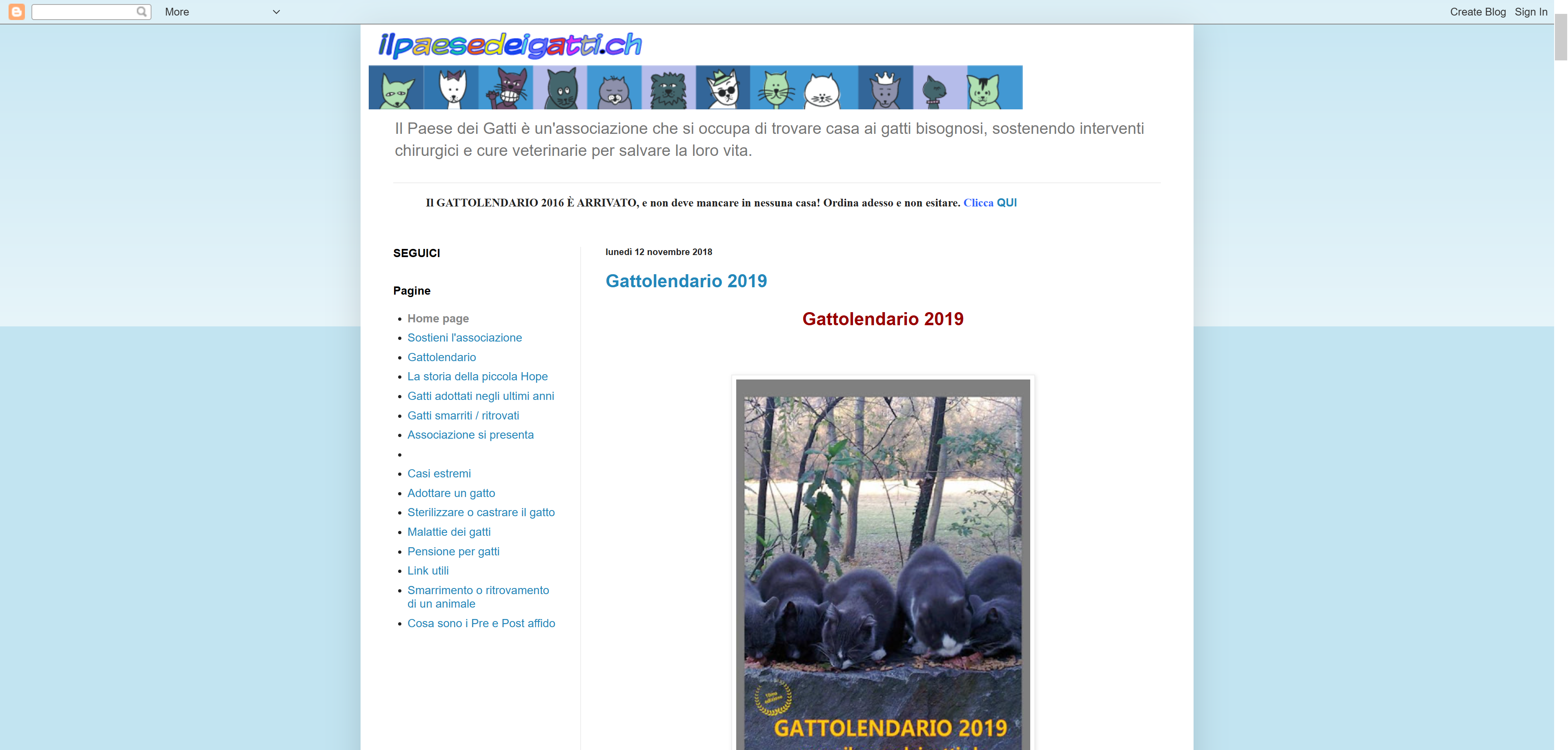
The first capstone project of DesignLab's UX Academy should have been a genuine unsolicited redesign of an existing website, i.e. ilpaesedeigatti.blogspot.com, a blog-turned-website that represents a small local cat shelter. Unfortunately, despite accepting the redesign, the owner did not want to collaborate during the research phase. This is why the research phase went on without being able to consider the true needs of the actual stakeholder.
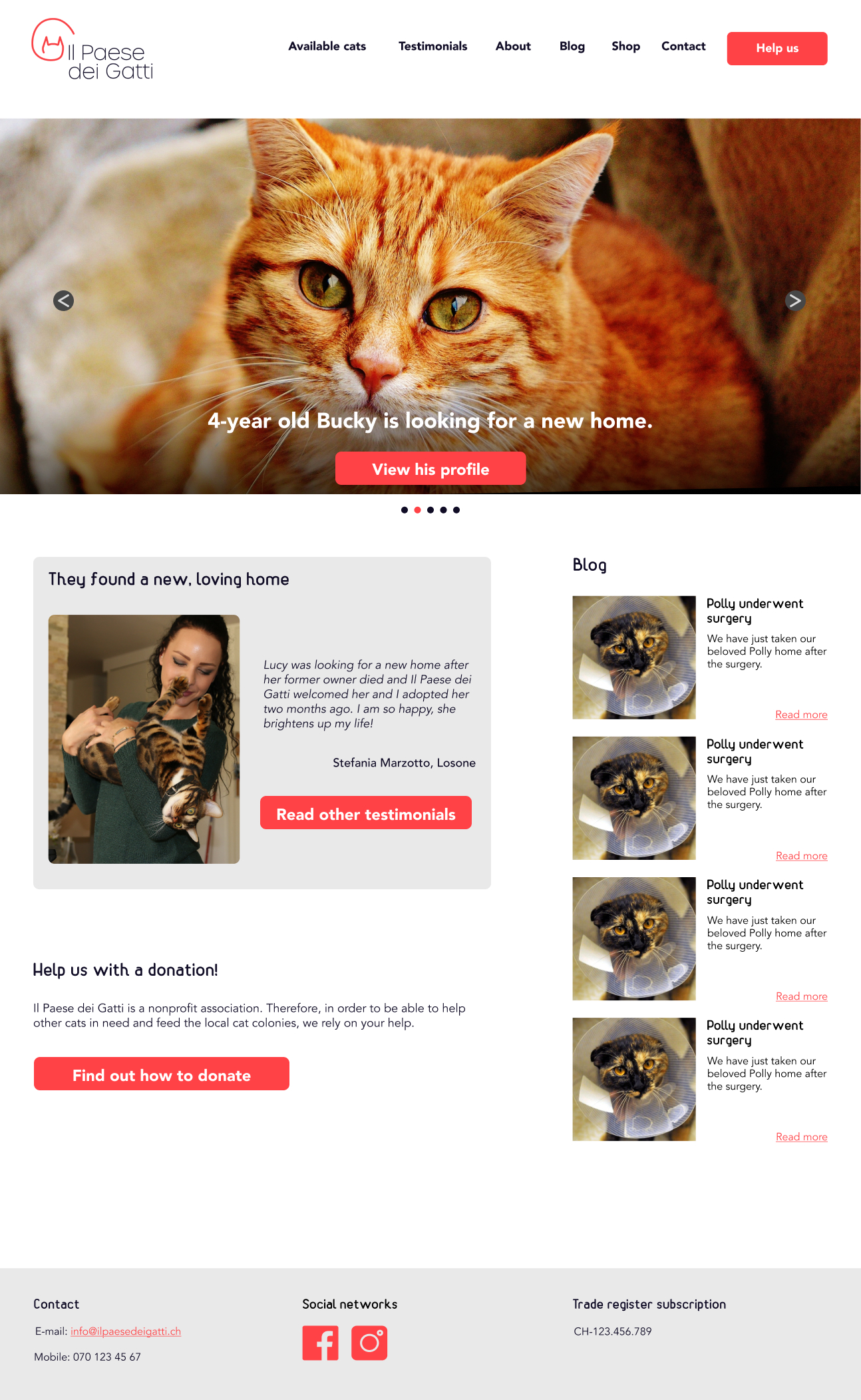
As the current website was not fully responsive and did not look professional at all, the main goal was to create a usable responsive website that would fit the cat shelter and inspire trust in the user. Creating a logo and definig the brand, both of which were absent, were additional goals.
Duration: 1 month.
Role: UX Researcher, UX/UI Designer.
Tools: Figma, InVision, Illustrator, Maze.
The Process
I carried out this project by applying the Design Thinking method.
STEP 1
EMPATHIZE
Research
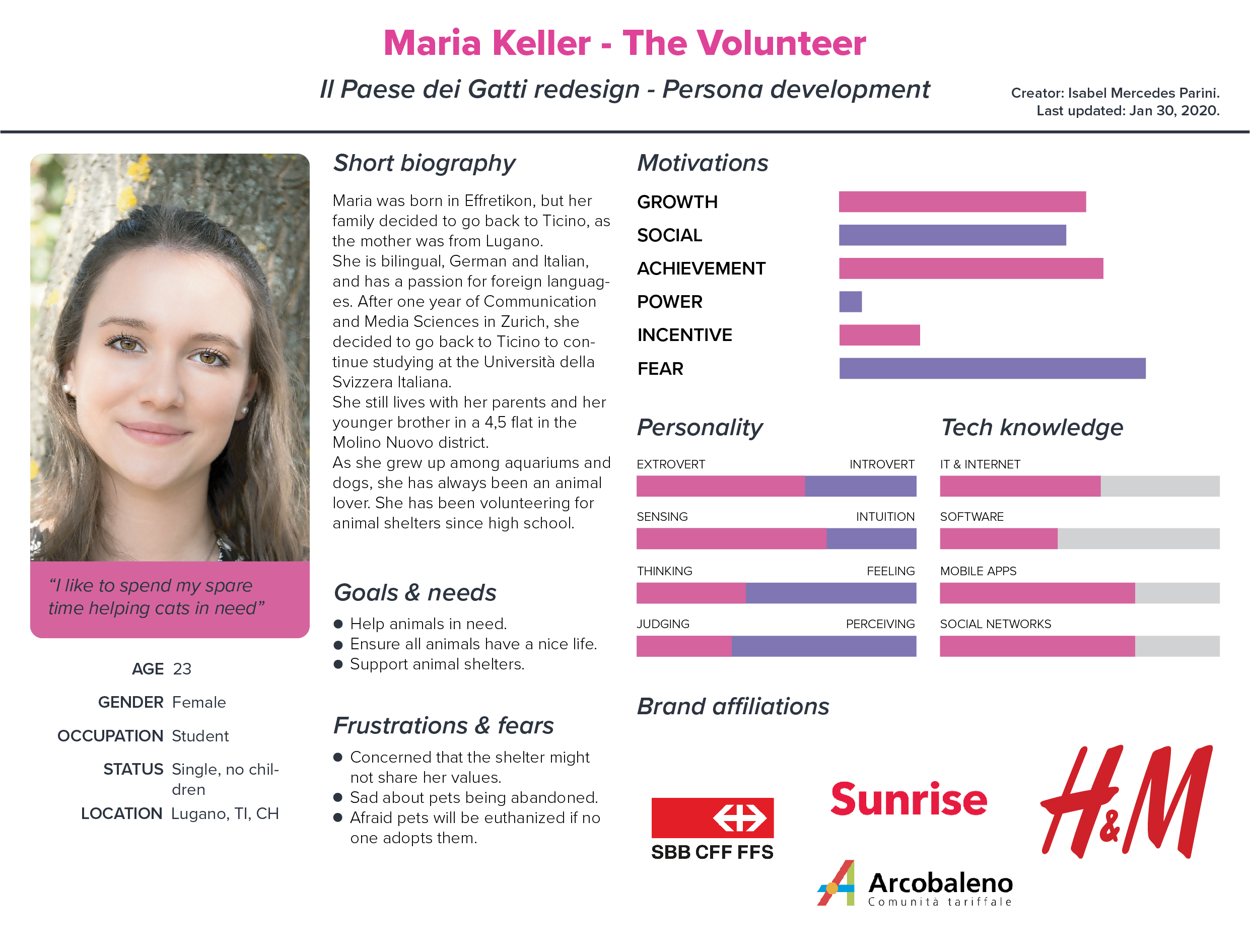
Persona
STEP 2
DEFINE
Feature roadmap
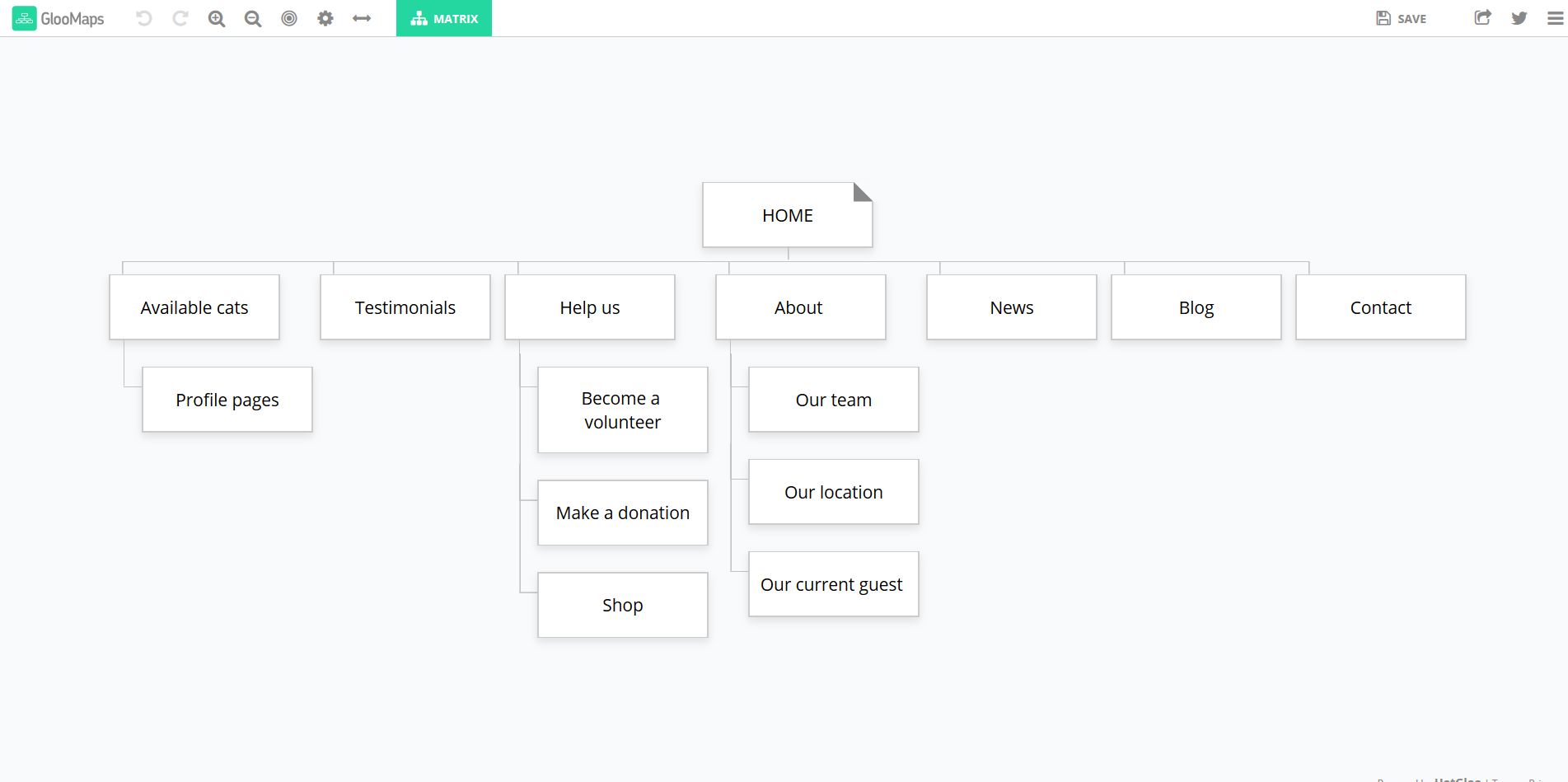
Sitemap
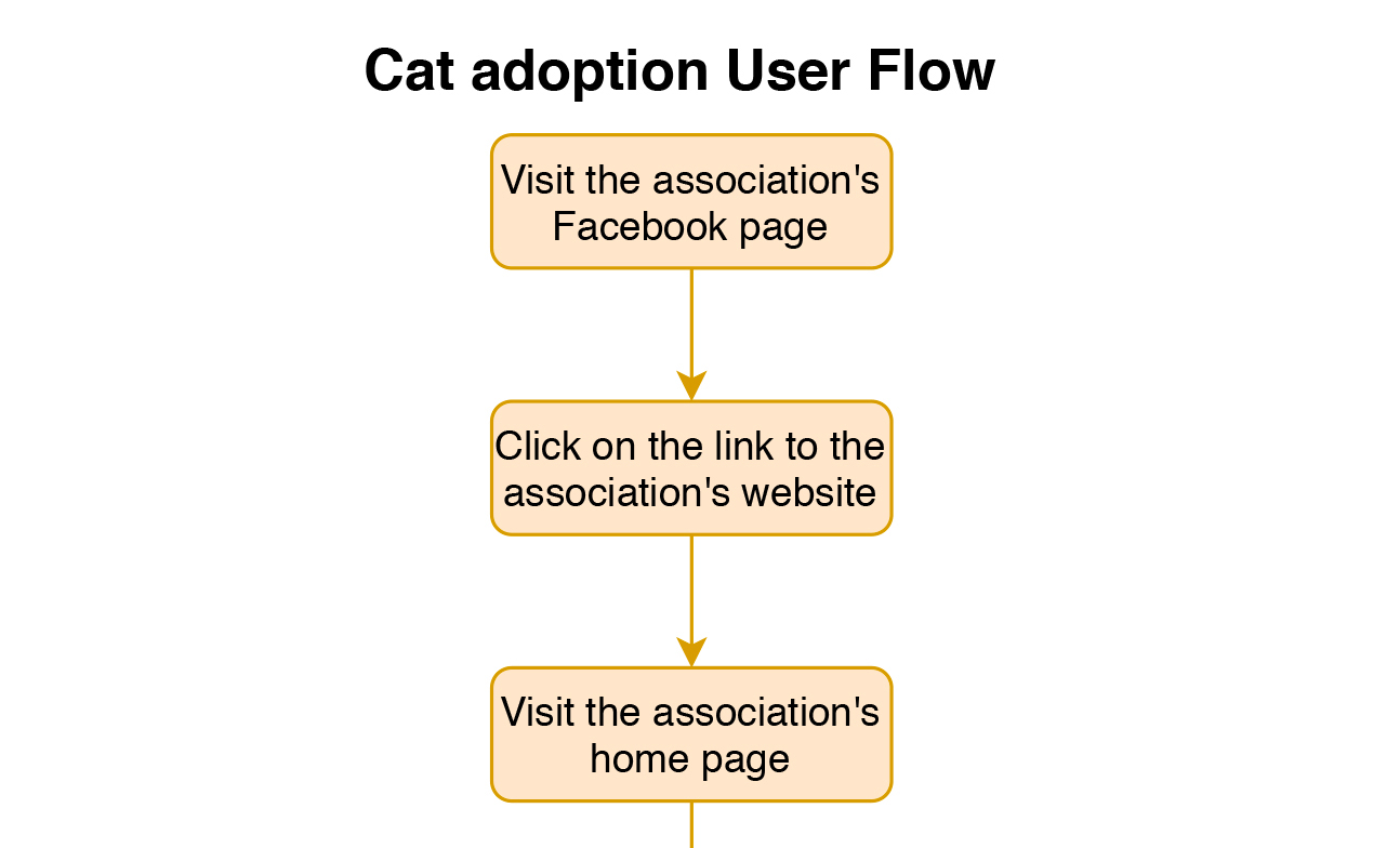
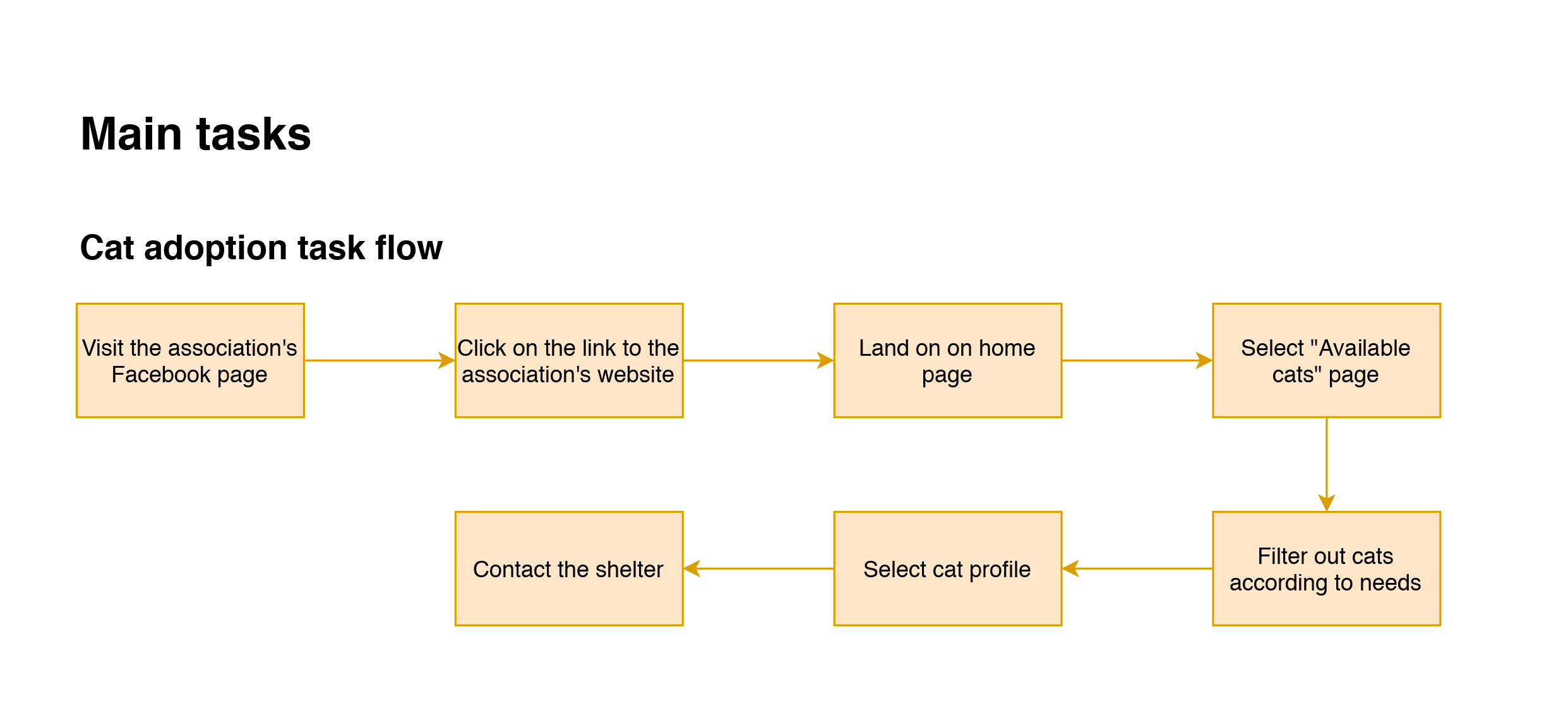
Task flows
User flows
STEP 3
IDEATE
Homepage Sketches
Wireframes
Logo
Style Guide
Mockup
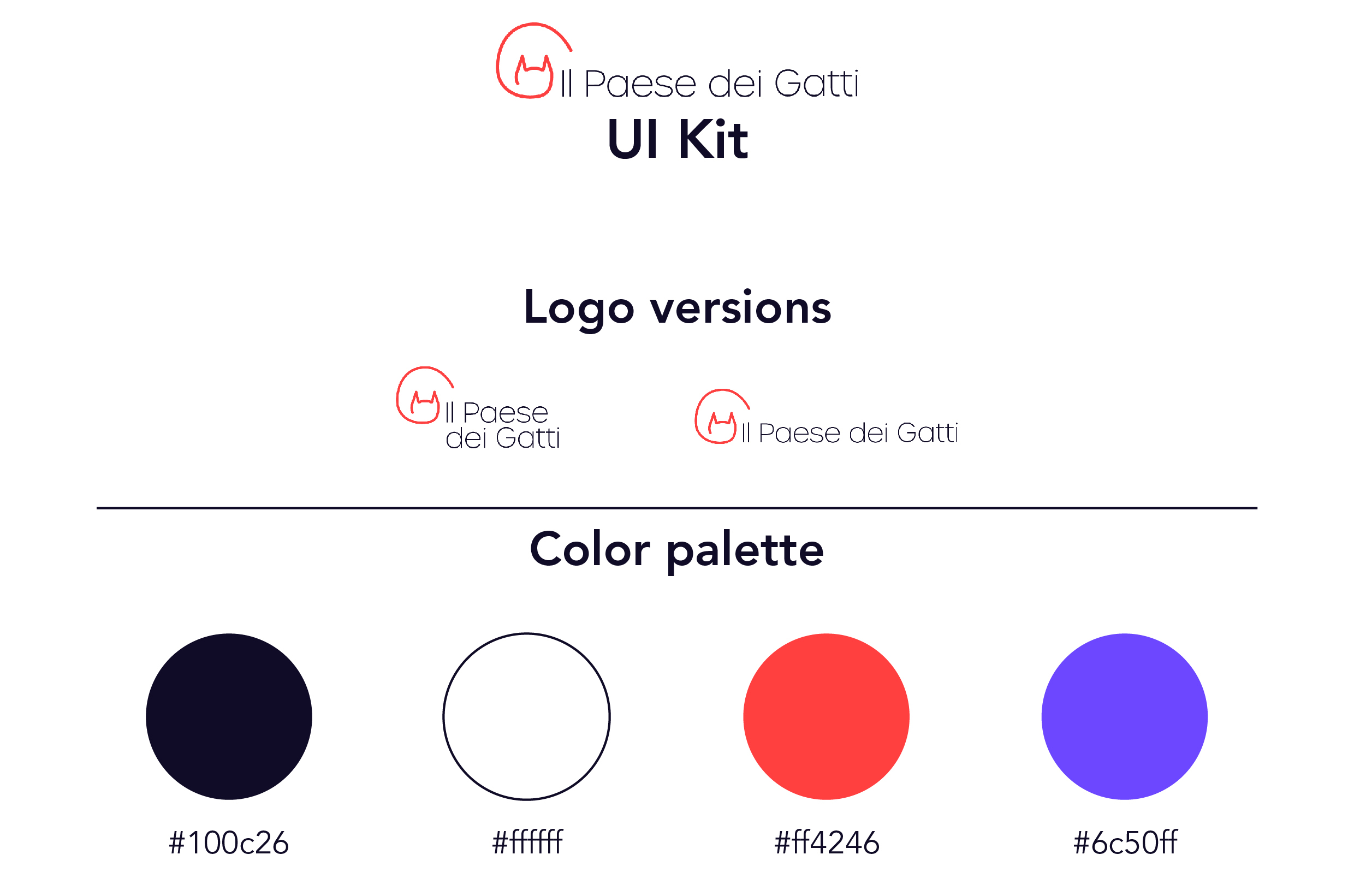
UI Kit
STEP 4
PROTOTYPE
STEP 5
TEST
Usability test plan
Usability tests
Report
Affinity map
ITERATE
STEP 1 - EMPATHIZE
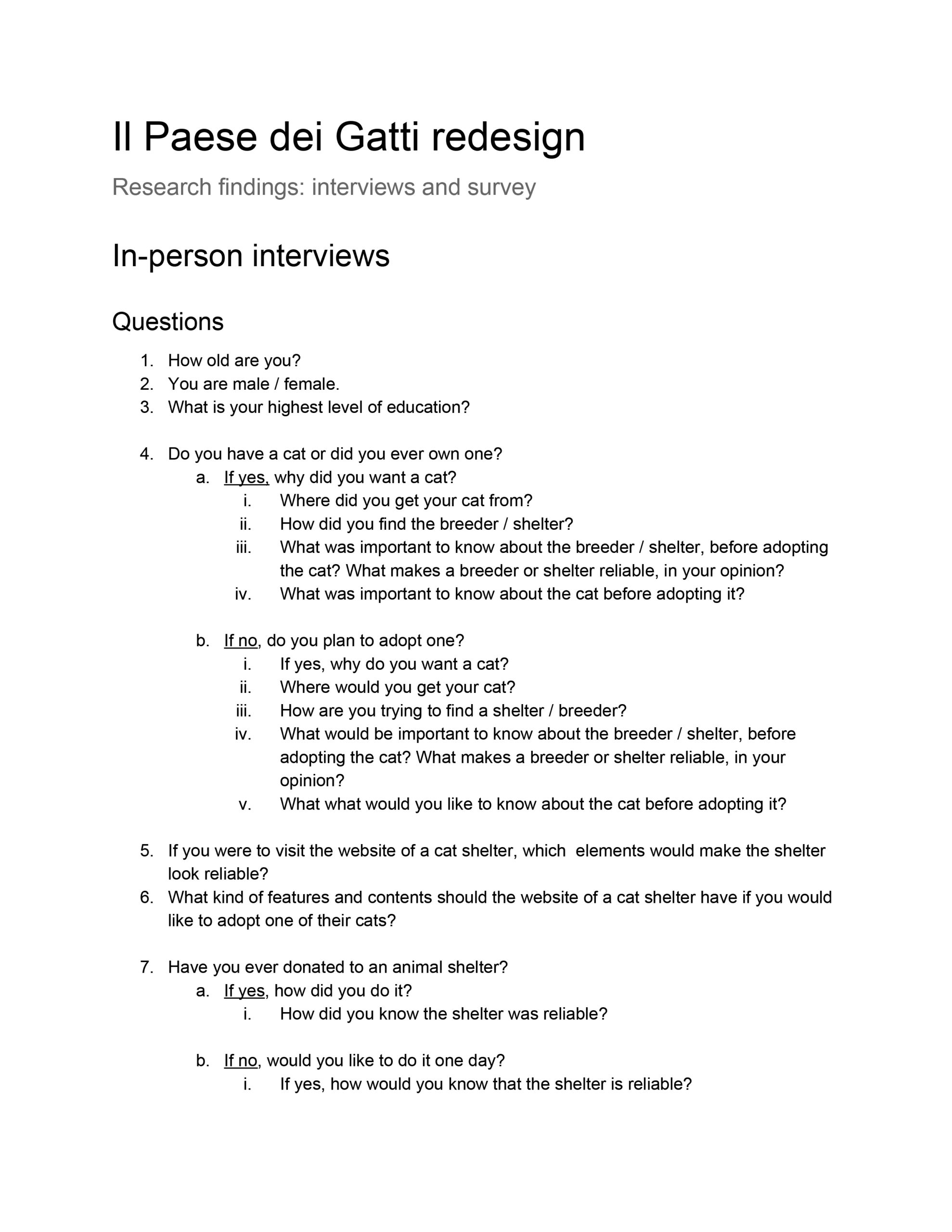
My research included a competitor analysis and interviews, both in-person and online using a questionnaire created with Google Forms. While the participants of the in-person interviews were recruited among family and coworkers, the participants of the online survey were recruited on Slack among fellow UX Academy students.
The goal was to get a feeling about what competitors were doing, find out what users would need to know to consider a shelter reliable (both in general and regarding contents of a website), how they chose/would choose their cat(s), and so on.
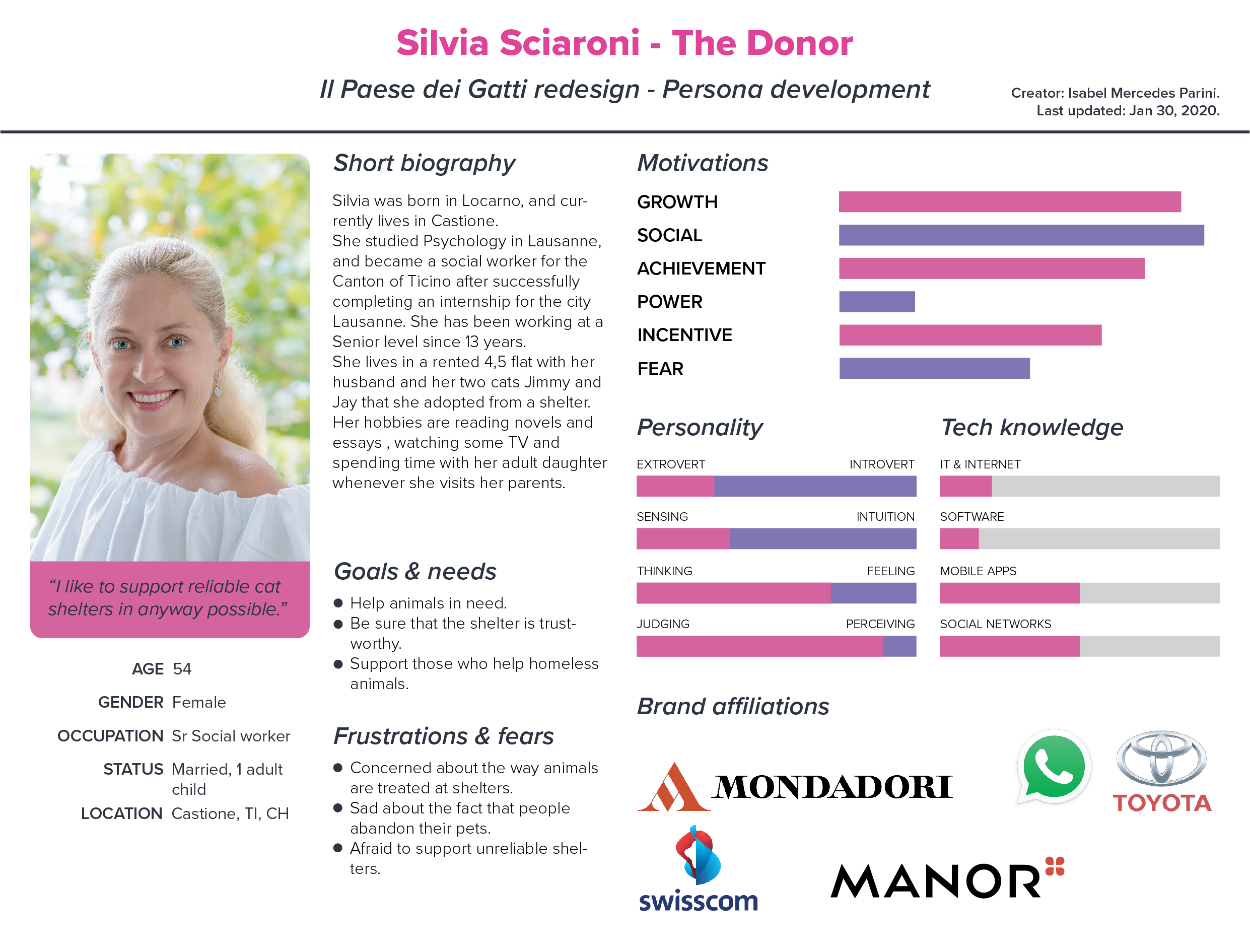
The results confirmed the type of provisional personas I had created during the research ramp-up, as among the interviewees there were people who had adopted a cat from a shelter, donated to shelters and/or was volunteering for shelters. It helped flesh out the personas, one for each user type (i.e. The Donor, The Volunteer, and The Prospective Adopter) with information based on real data concerning e.g. their needs and fears.
In general, regarding the online presence of a cat shelter, respondents valued beautiful pictures of cats and location, a professional layout and testimonials by cat adopters when it came to reliability.


STEP 2 - DEFINE
The insights gathered during the research phase were extremely valuable and they helped me during the next phase of defining the product. My approach included constant iteration, albeit user testing only happend after creating the mockups.
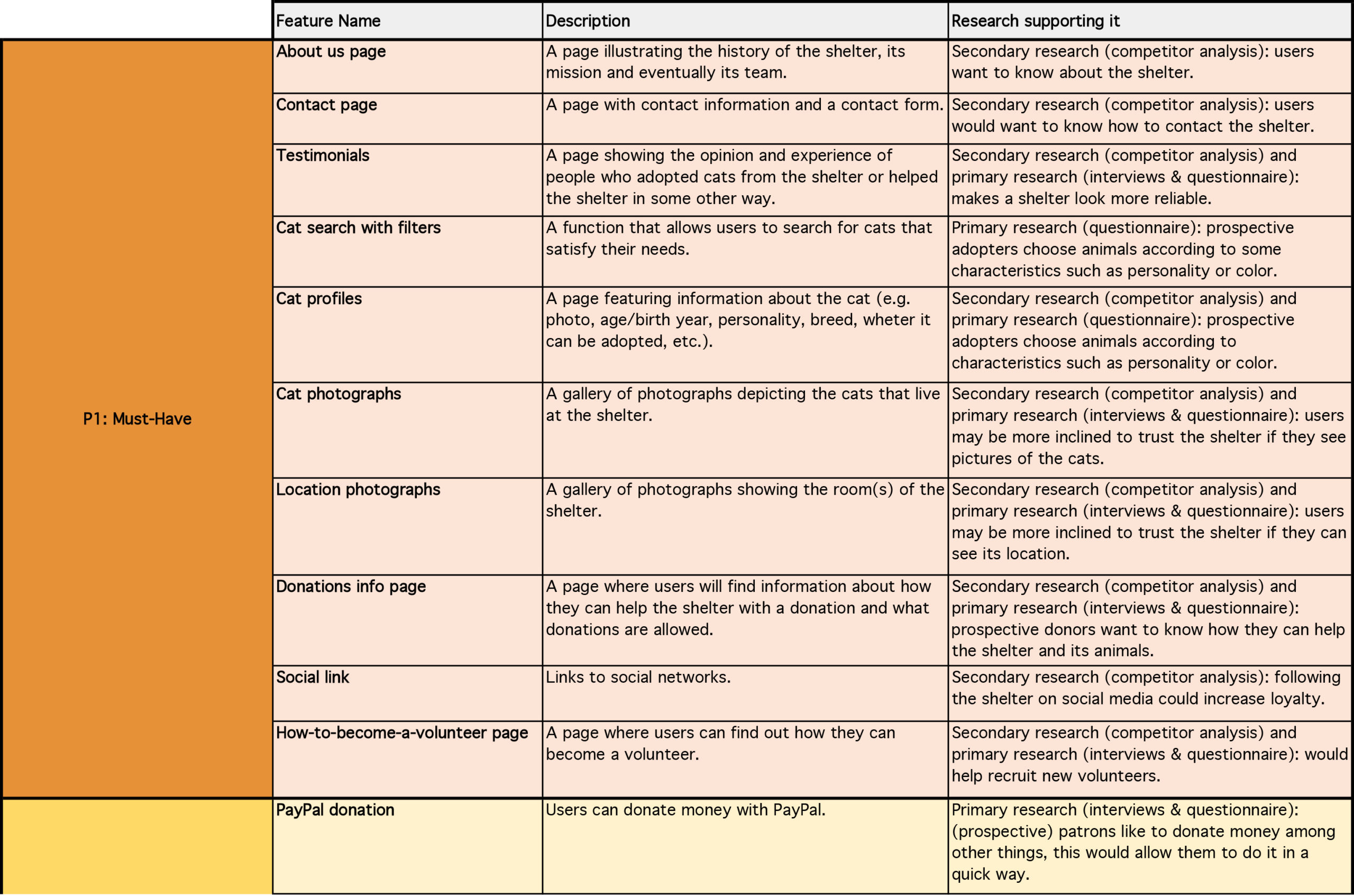
Based on the research, I created the feature roadmap, that ranked the features from must-have to "can come later". Later, I created a sitemap that showed how the website would be structured. In order to define the steps and therefore the pages required for each one of the main tasks that had previously arisen from the three personas, I created task flows and user flows.
STEP 3 - IDEATE
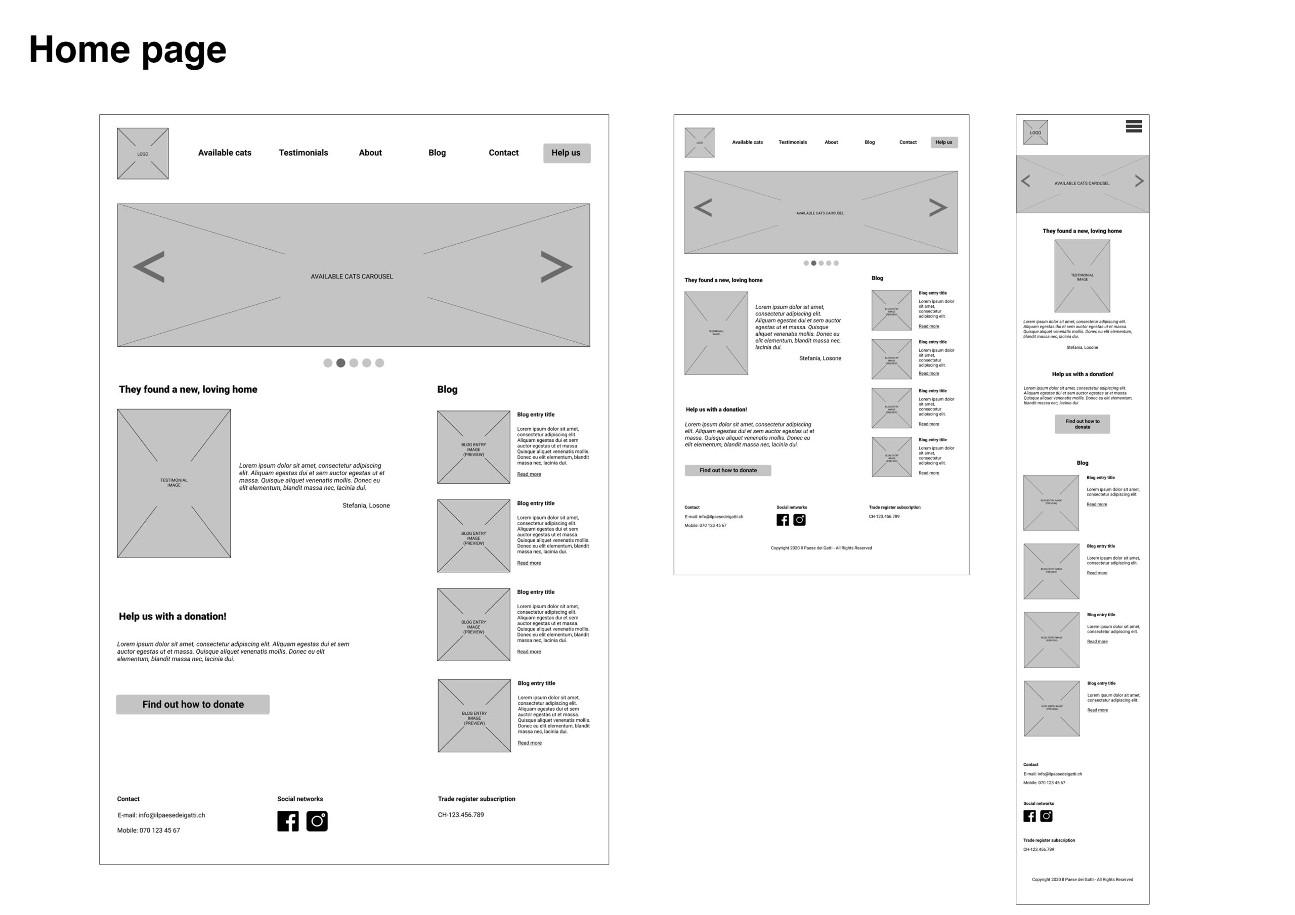
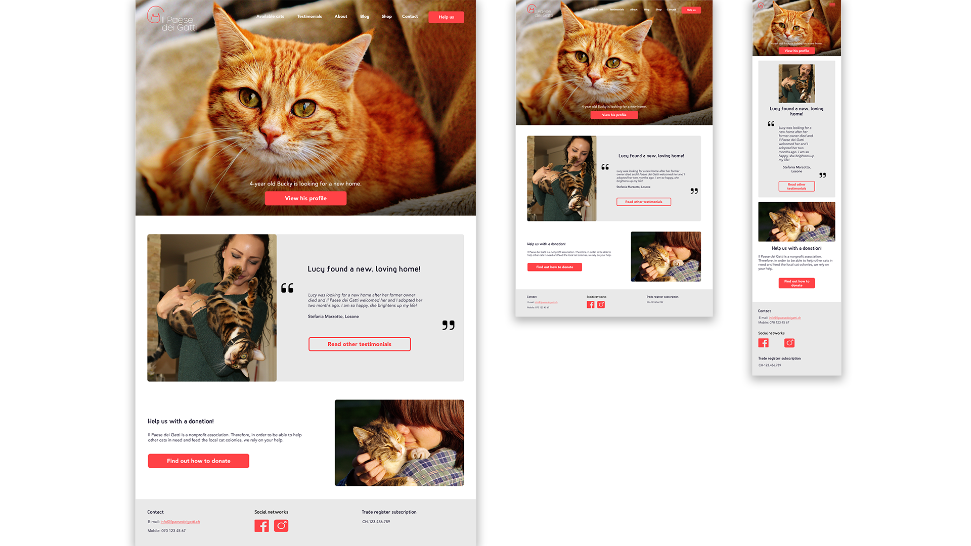
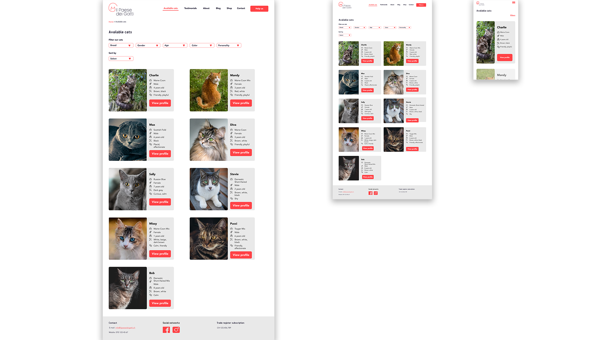
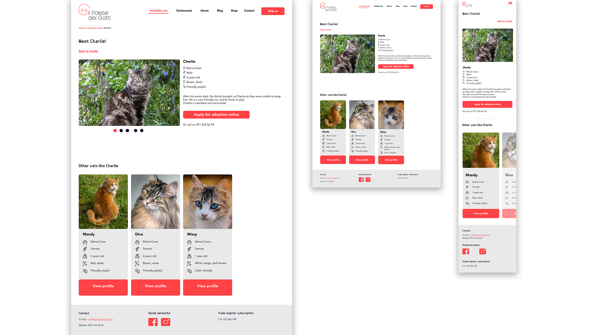
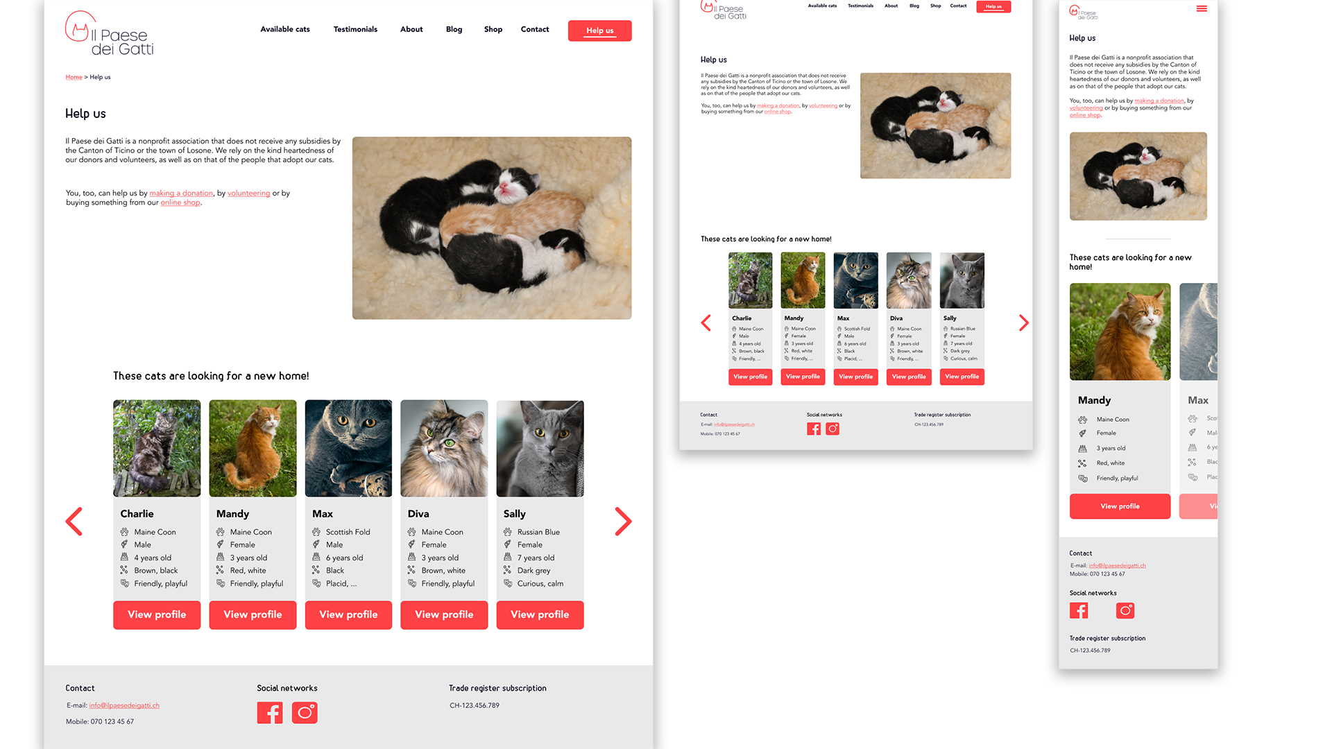
I sketched different versions of the home page and then proceeded to create grid-based, responsive wireframes using Figma.
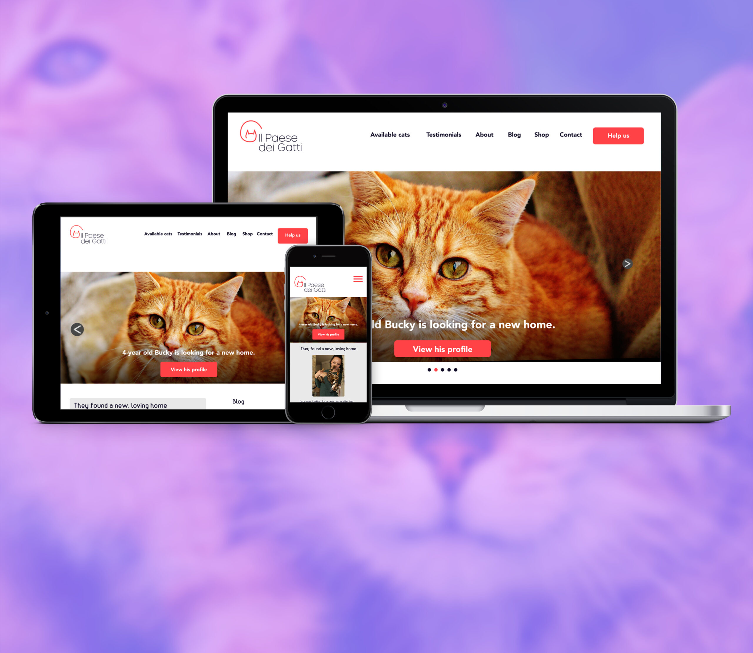
After a brainstorming session that helped me defining the brand's attributes, I created the logo, as well as a style guide, and was then ready to create the first mockup, which underwent various iterations. Later, I also created a UI kit that would illustrate several important aspects of the design.
While I like creating wireframes, applying the brand elements to a design is extremely rewarding, as it makes the screens become alive, like adding flesh and skin to a bare skeleton.
Creating a logo is always challenging, although brainstorming sessions are very helpful. But finding the right combination of color, type, sizing and placement is always tricky.


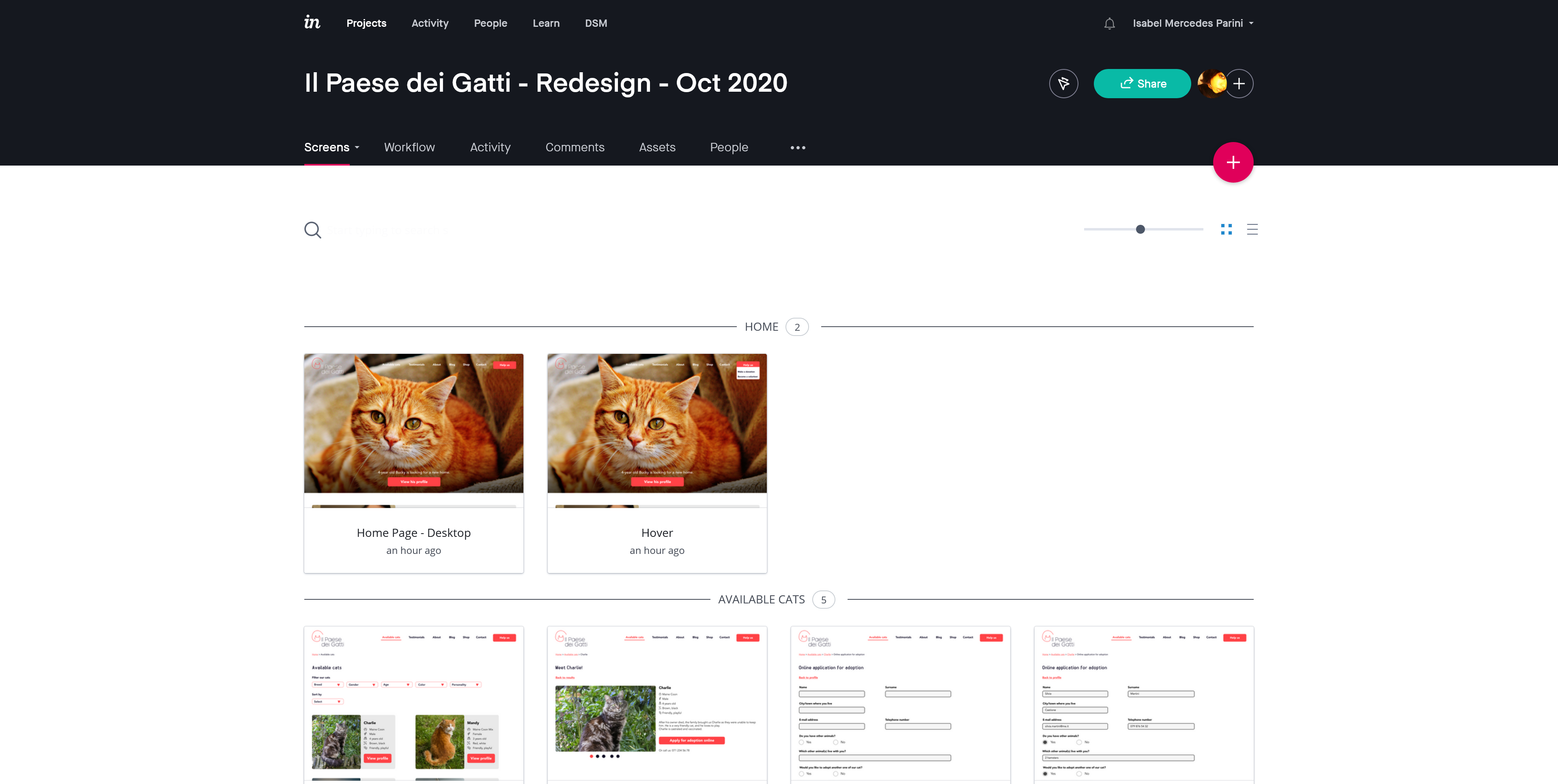
STEP 4 - PROTOTYPE
After creating the mockups for all three screen types (i.e. desktop, tablet, mobile phone), I developed a protptype using InVision.
This helped me understand whether all the steps the user would need to follow to complete the main tasks presented in the task flow were present.
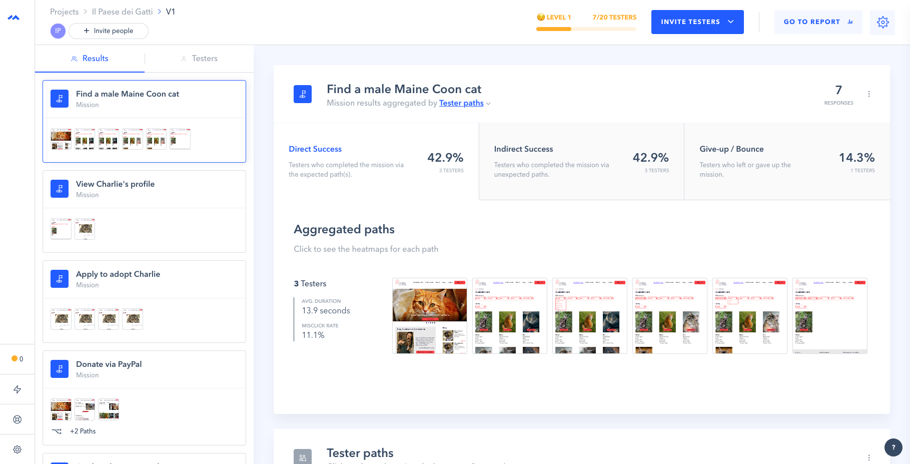
STEP 5 - TEST
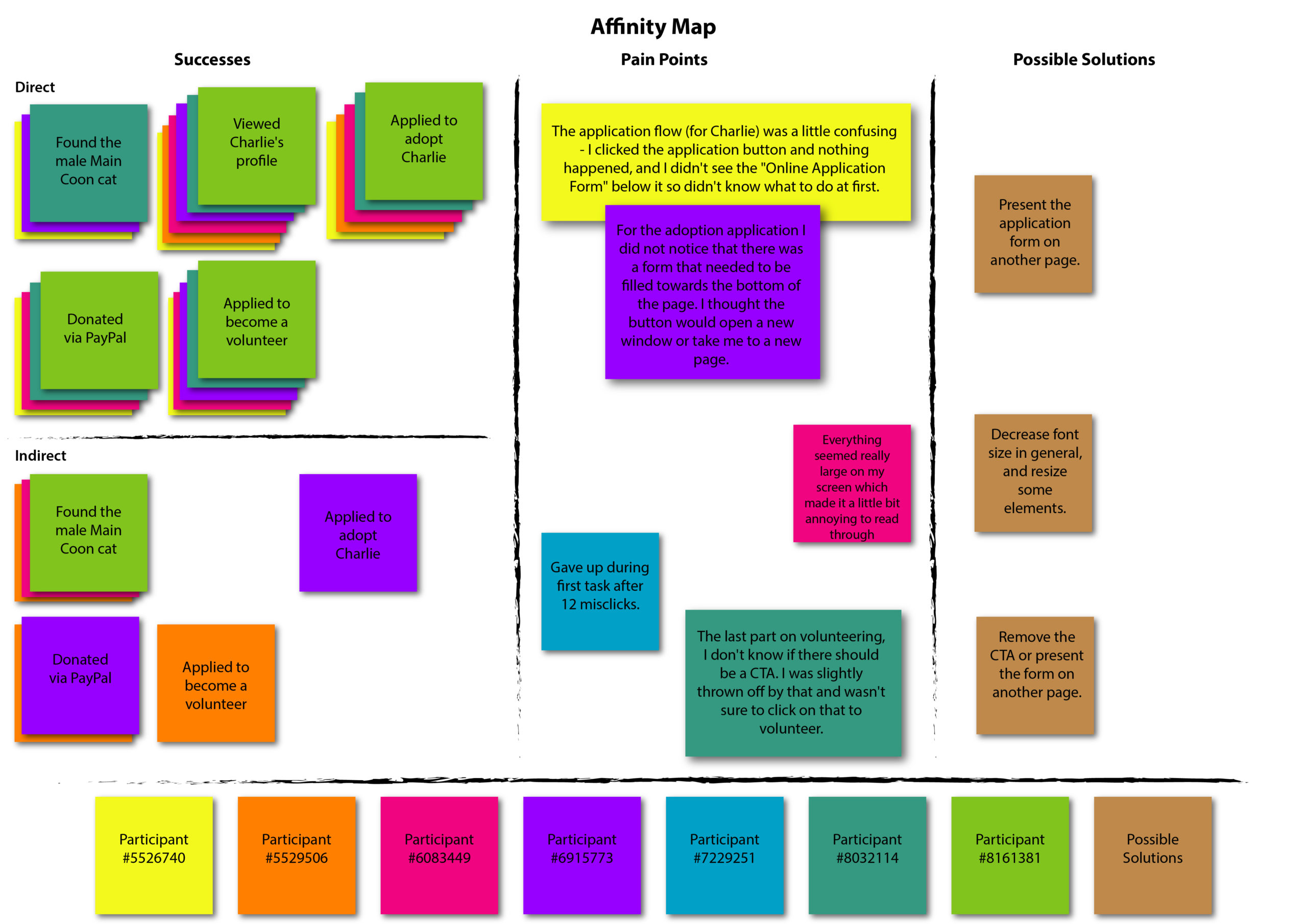
After defining the test objectives and other specifications, I used Maze to conduct my usability tests on the desktop version. The results were then gathered and summarized in a report and illustrated by means of an affinity map that included possible solutions to the problems that were highlighted by the test.
In general, the users were able to complete all tasks. Issues concerned e.g. the form to apply for adoption, as users either missed it (as it would appear once the CTA was clicked) or expected to be directed to another page. One user also perceived all elements to be too big, confirming a doubt I had.

Conclusion
This was the first project I carried out without the guide that was provided at the beginning of DesignLab's UX Academy. Despite this, all steps ran smoothly and it was interesting to dive into the world of (cat) shelters, as, like the respondents of my interviews and questionnaire, I love animals.
As illustrated by the Before/After image below, the resulting website would finally offer a professional presence to the cat shelter, with beautiful pictures and testimonials, which are all elements that prove the shelter is reliable, according to my research. Moreover, the website would now be easily navigable with a desktop, tablet or mobile device.
Given more time, I would also have conducted in-person, moderated usability tests and recruited more interviewees, both for the in-person interviews, as well as for the survey.
Overall, I enjoyed every step of this project, not only because of the topic, but also because each phase led to the creation of a valid redesign of a blog-turned-website that was neither professional nor appealing, as the layout looked quite disorganized and inconsistent, and it was not very responsive.
Selected Works
Contact Me
Copyright © 2025 Isabel Mercedes Parini.
All rights reserved.