Seasonal App
An app I designed for the third and last Capstone Project of DesignLab's UX Design bootcamp.
The Project
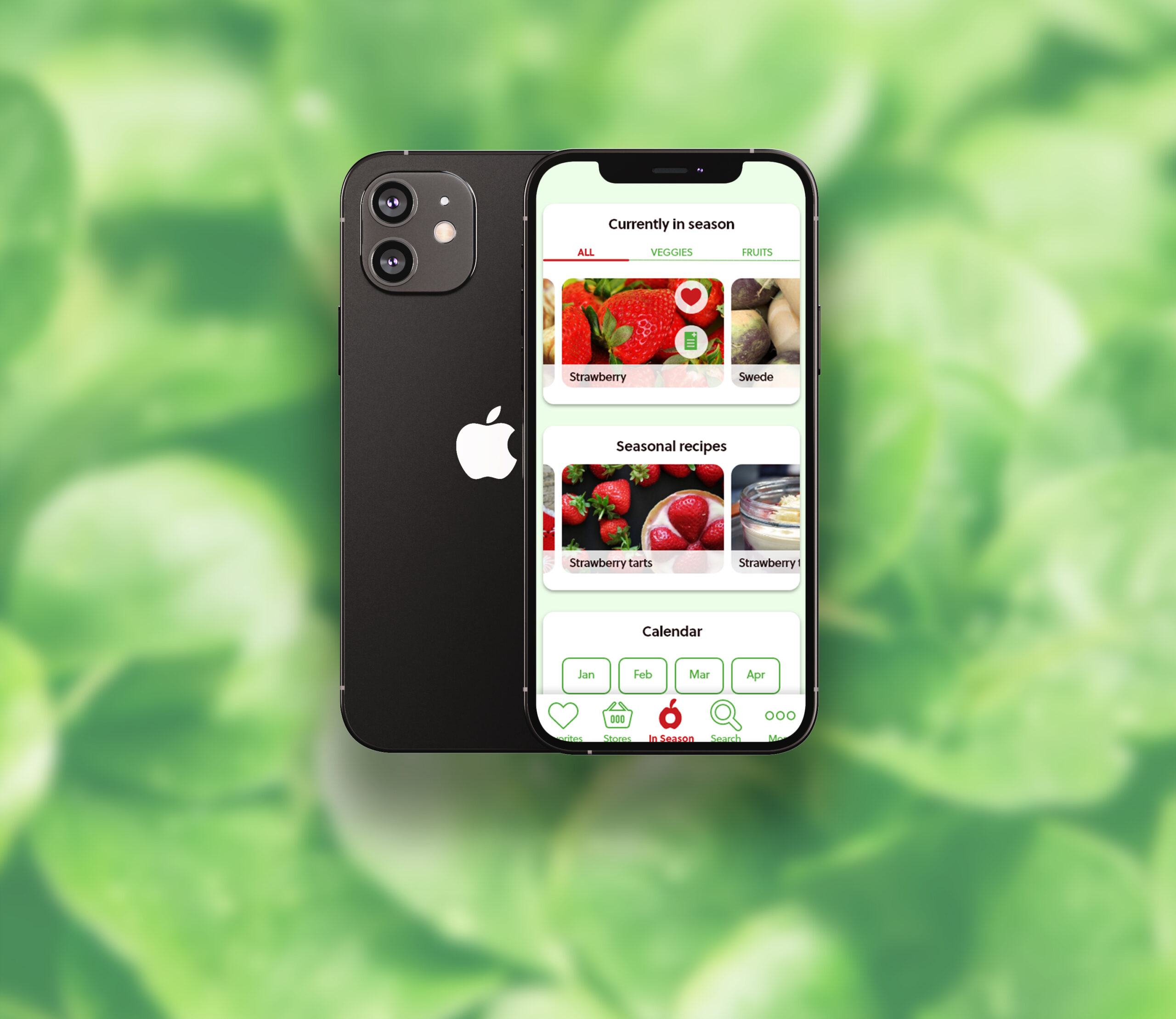
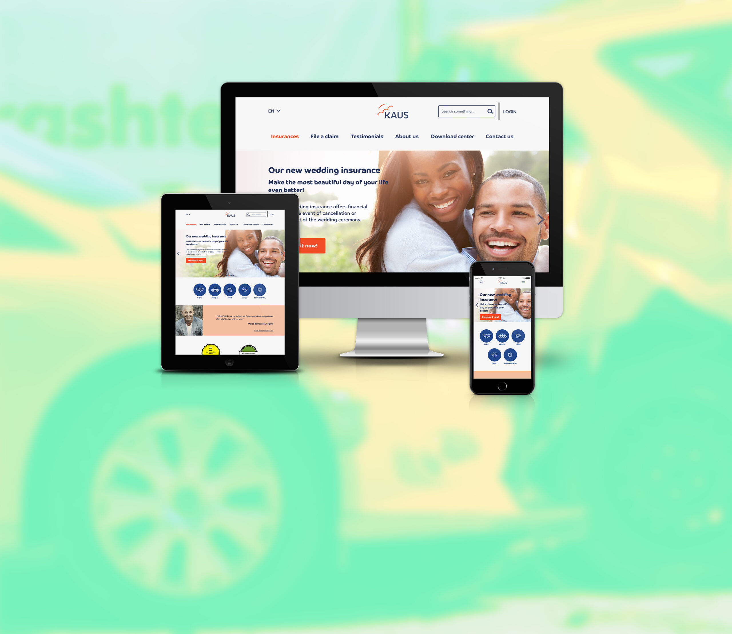
The goal of the third and last Capstone project of DesignLab's UX Academy was to create an and end-to-end app. After doing some research on Google, I decided to design an app that shows users in-season fruits and vegetables each month.
Users would also be able to check out seasonal recipes featuring this food, as well as find grocery stores and markets nearby and create a shopping list. The app's name is "Seasonal".
Duration: 1 month.
Role: UX Researcher, UX/UI Designer.
Tools: Figma, Adobe XD, InVision, Illustrator, Maze.
The Process
I carried out this project by applying the Design Thinking method.
STEP 1
EMPATHIZE
Research
Persona
STEP 2
DEFINE
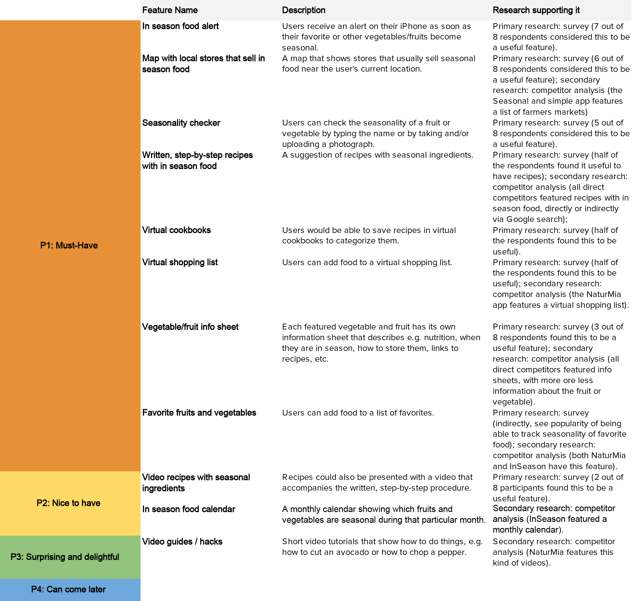
Feature roadmap
Sitemap
Task flows
User flows
STEP 3
IDEATE
Wireframes
Moodboard
Logo
Style tile
Mockup
UI kit
STEP 4
PROTOTYPE
STEP 5
TEST
Usability test plan
Usability tests
Report
Affinity map
ITERATE
STEP 1 - EMPATHIZE
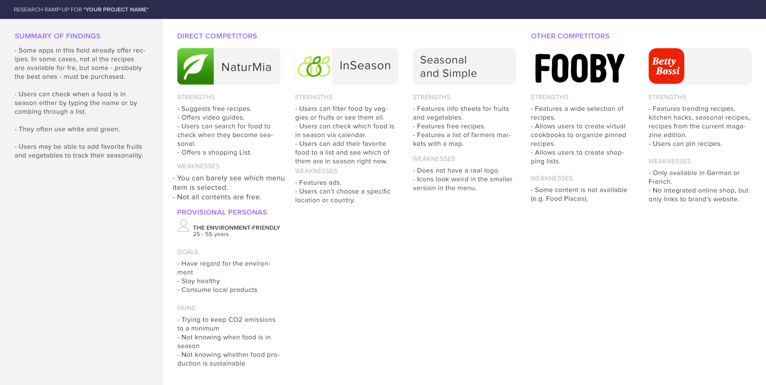
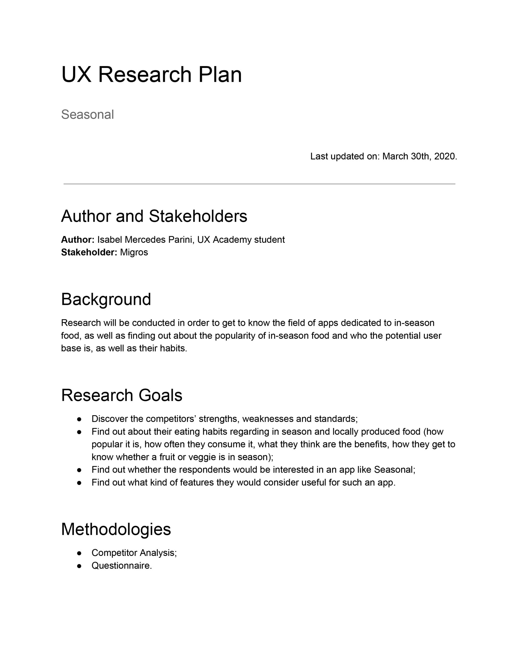
To dive into the subject, I started with a research ramp-up. After defining the goals and scope of the broader research in a research plan, I conducted a competitor analysis. I found some apps that were already showing users which fruits and vegetables were in season, giving them also a selection of recipes and in one case, showing markets. However, these markets were only located in the United States, as the app was developed in this country.
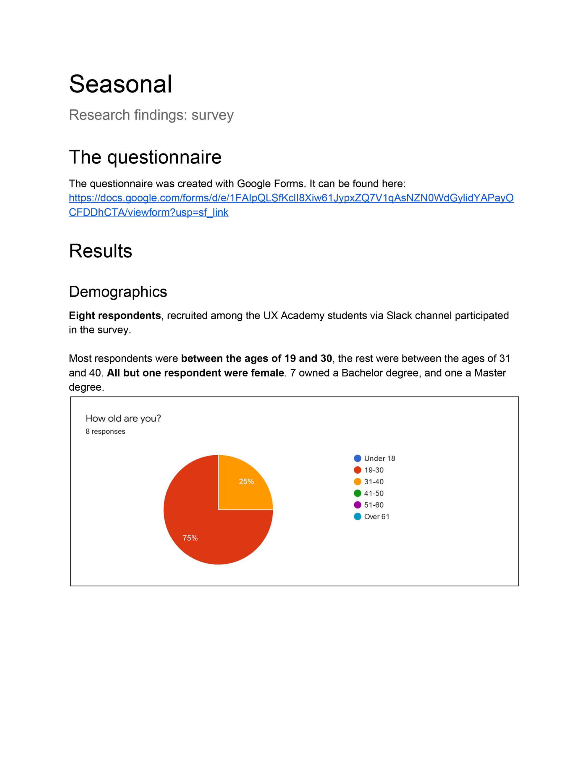
What the competition was doing helped me thinking about what possible features my app could have and it also helped me while creating the questionnaire with Google Forms for the survey. Participants were then recruited among fellow UX Academy students on Slack.
It was interesting to find out that the respondents valued localness of food over its seasonality. The users also helped me ranking the potential features I presented in the questionnaire. They also suggested other features or a development of core features.
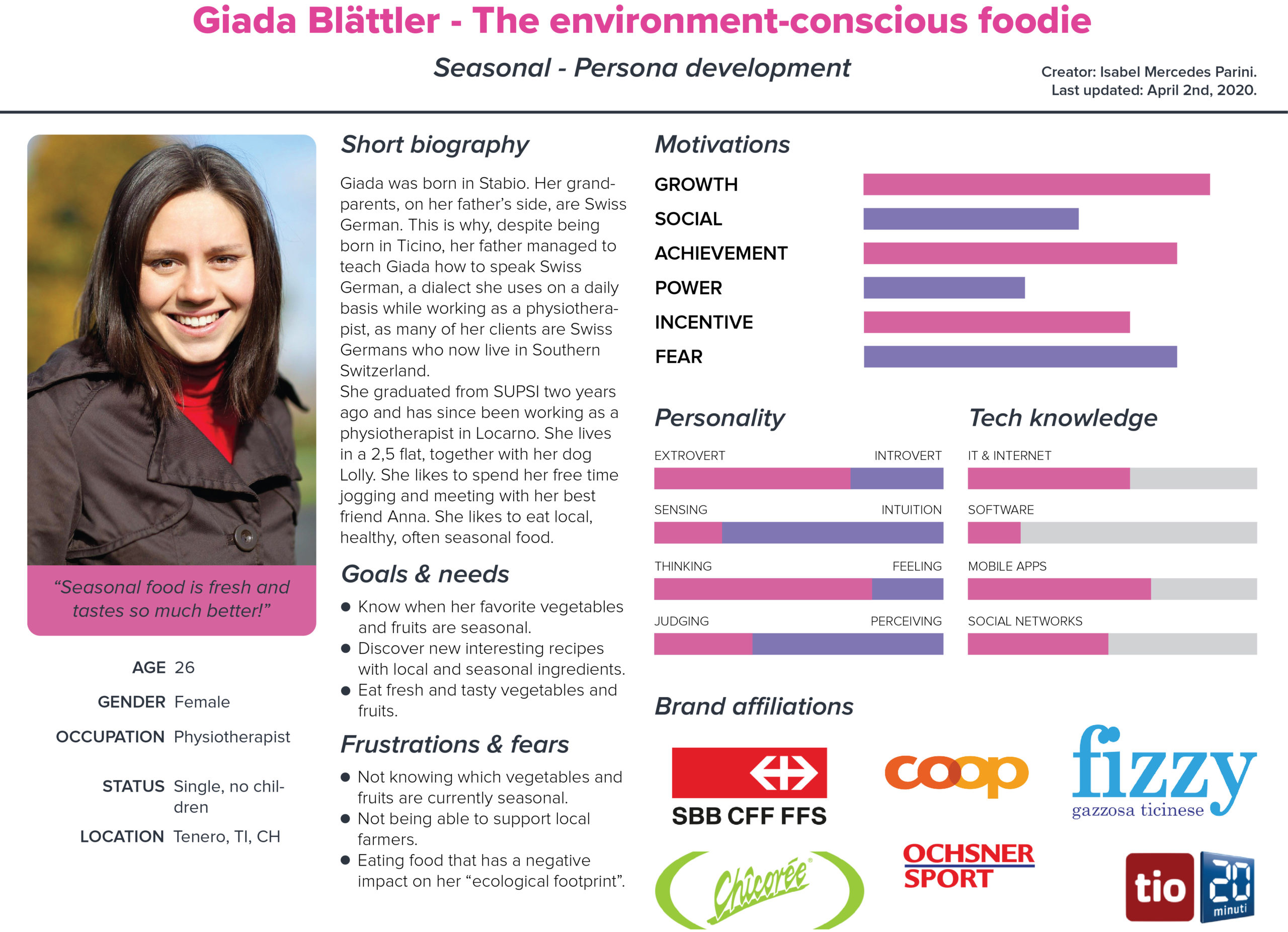
All the usear research findings, helped me create a persona that would represent the user base.
STEP 2 - DEFINE
After the research phase that culminated in the creation of a persona that would lead me through the next steps, I was able to produce a feature roadmap that showed the features and their ranking, from "must-have" to "can-come-later".
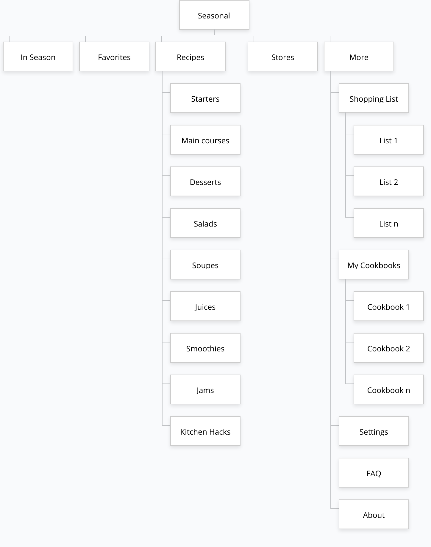
Once the features were defined, I created a sitemap that would allow me to define the hierarchy, as well as the groups of content.
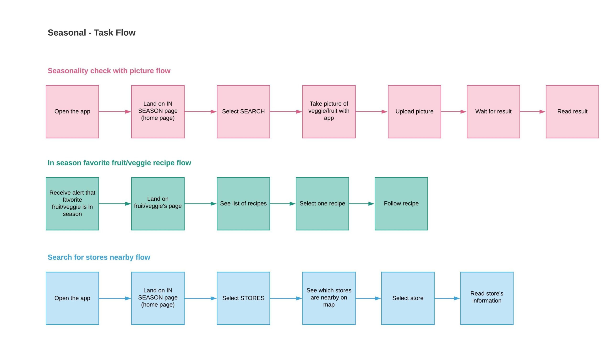
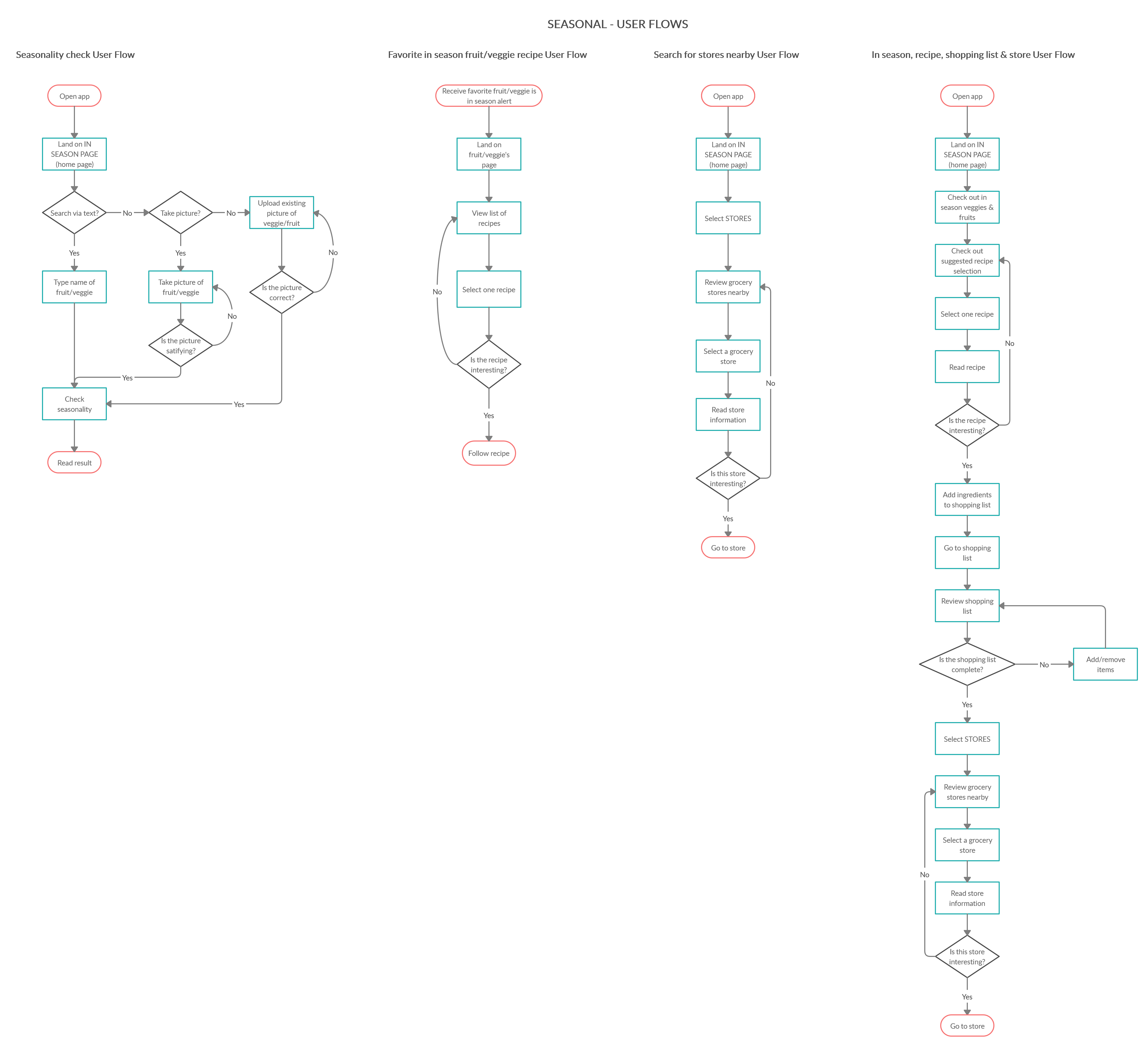
In order to clarify the steps a user had to go through to complete essential tasks, I created task flows and, later, also user flows that would present the tasks with more details and choices. Different task and user flows were needed, as, besides checking what was in season, I had previously identified other core tasks during my research, like one that involved recipes and one that involved looking for grocery stores nearby.
STEP 3 - IDEATE
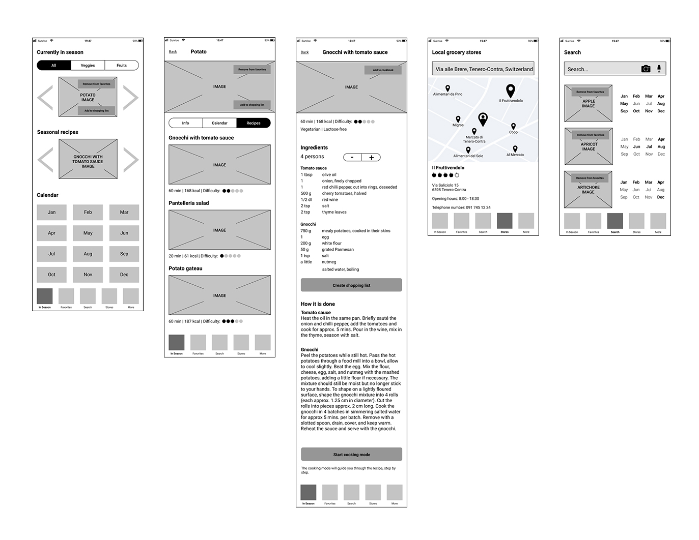
After the research and the definition phase, it was time to use Figma to create grid-based wireframes that would illustrate the structure and hierarchy of the content on the different screens that would allow a user to perform the main tasks.
In order to discover issues early on, after creating a prototype with InVision, I developed a usability test with Maze. These two steps will be discussed further in the next two phases, i.e. the Prototype and the Test phase.
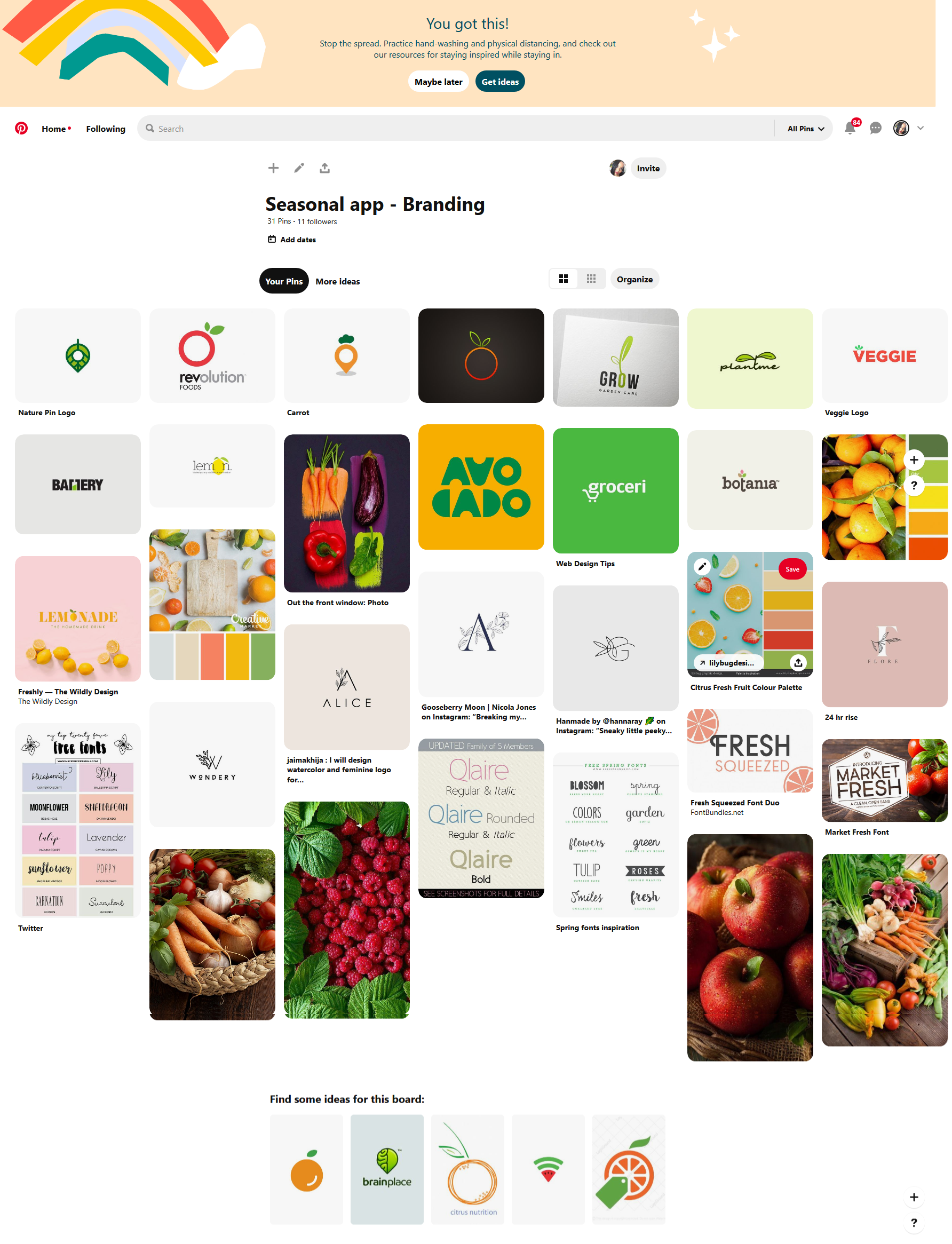
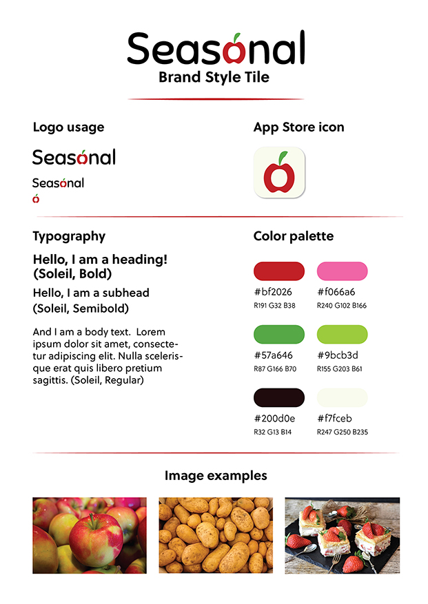
Before starting with the UI design, I created a moodboard on Pinterest, that would show the look and feel of Seasonal's branding I had in mind. Once the branding's starting point was set, I created a logo that would best represent Seasonal, and a style tile that would define the elements I would later use in its UI design.
As the app shows which fruits and vegetables are in season, I chose to integrate a fresh apple into the logo, which is a direct link to food and, as an icon, is easily recognizable and looks inviting.
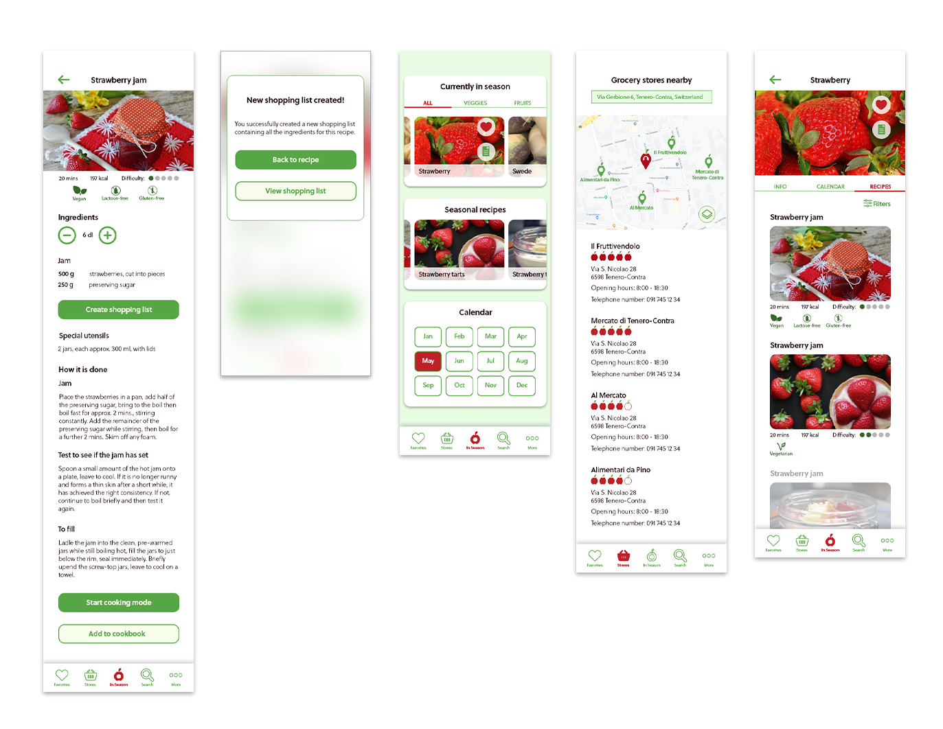
The findings of the usability test performed on the wireframes helped me while translating the wireframes into mockup screens, following the guidelines defined in the style tile. After that, the essential elements of the UI design were gathered in a comprehensive UI kit.
STEP 4 - PROTOTYPE
As anticipated in the previous phase, I had created an early prototype already with the wireframes. The second one was instead created with the mockup screens.
I used InVision for both prototypes.
STEP 5 - TEST
I used Maze to create and run both tests.
Despite their limitations in terms of UI, testing the wireframes proved to be useful, as it managed to highlight some shortcomings in hierarchy and structure. The main problem was the search-by-image function, which was not tested further, as it was clear, after the first tests, what was the main purpose of the app, i.e. checking what is currently in season. This was later highlighted in the main menu (i.e. "In Season" being the central element).
The test on the mockup ran more smoothly, probably also because some issues were addressed right after the wireframes test. Another solution that may have proved to be correct, was to not make the main menu sticky like in the previous test, as the participants who tested the wireframes often did not find content below the safe area. This was not the case with the mockup.
After running each test, I gathered the results in a report and illustrated them in two affinity maps (one for the wireframes prototype, one for the mockup version) that also presented some potential solutions.
Conclusion
This was the third and last Capstone project of this exciting and challenging journey that was DesignLab's UX Academy.
Even though creating an app from scratch was daunting at first, once I found the idea I would like to develop, Seasonal's genesis went very well. The steps I would follow while applying the Design Thinking process were clear from the start, and I managed to adapt them to suit my needs.
In order to ensure the quality of the result would be high, I decided to run two tests, one on the wireframes and one on the mockup screens. And since the usability score of the second test was high, this proved to be the right choice.
I enjoyed each one of the steps that led me to Seasonal's most recent version. Moreover, the end result, which could of course be improved even further given more time, is more than satisfying, since, according to my research, it would satisfy the needs of a potential user base in an easy, enjoyable and appealing fashion.
Selected Works
Contact Me
Copyright © 2025 Isabel Mercedes Parini.
All rights reserved.